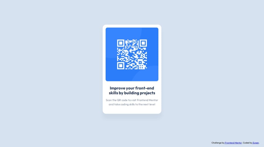
Design comparison
Solution retrospective
I remembered what I've learnt from Ken Powell, and used vars and hsl instead of simple hex colors.
What challenges did you encounter, and how did you overcome them?I encountered some issues with the CSS classes, for example .container, or .card-main. They were working fine form local host, but not showing at all in the Github live page.
I've used Chat GPT for a solution and it looks like these classes were conflictig with some defaults, and after renaming them, everthing worked just fine.
What specific areas of your project would you like help with?I would like to know if anyone else encoutered the issue with classes. It was strange because in VS code live server everything worked fine, and one uploaded, the css was a bit broken
Please log in to post a comment
Log in with GitHubCommunity feedback
- @Ruran8wa
Hello Eugen, it's great work you've done here; while looking through your codes, I saw that you used Flexbox however, while doing this challenge, I didn't. I have a question for you. Will you please tell me what made you use the Flexbox? is there any specific use case you found that made it perfect to use Flexbox? I would love to learn this from you and make sure that next time, I do things better, thanks
Join our Discord community
Join thousands of Frontend Mentor community members taking the challenges, sharing resources, helping each other, and chatting about all things front-end!
Join our Discord
