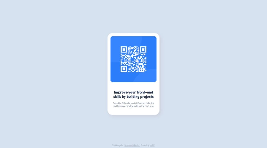
Design comparison
Solution retrospective
Not sure if I got close to the real result, but i should study more tags and elements from css.
What challenges did you encounter, and how did you overcome them?Confused on how to center the elements on to the screen. But i overcame them by googling possible tags and properties in both html and css.
What specific areas of your project would you like help with?Definitely when you're supposed to move the element somewhere specific on the screen. In this case, i feel like it was way too difficult to center the card exactly in the middle of the site.
Community feedback
- @RobertLikesCodingPosted 8 months ago
Hey Allan!
Nice work! I saw you were struggling with the positioning and ended up using absolute positioning. One way I like to use when dealing with these big one page designs with something centered in the middle is setting the section or div elements'
height: 100vh. This gives you a full-screen to place your element in. You could then center it usingdisplay: flex, justify-content: center, align-items: centerfor example.Try it out if you want. :)
One other tiny thing I noticed was your alt tag in the
imgelement. I know this is just a challenge but you could make it more descriptive than just saying "qr-code". I like to imagine a screen reader reading the alt tag back to me and then ask myself "Would I understand what is on the picture?".I hope this was helpful! Happy coding!
Marked as helpful1
Please log in to post a comment
Log in with GitHubJoin our Discord community
Join thousands of Frontend Mentor community members taking the challenges, sharing resources, helping each other, and chatting about all things front-end!
Join our Discord
