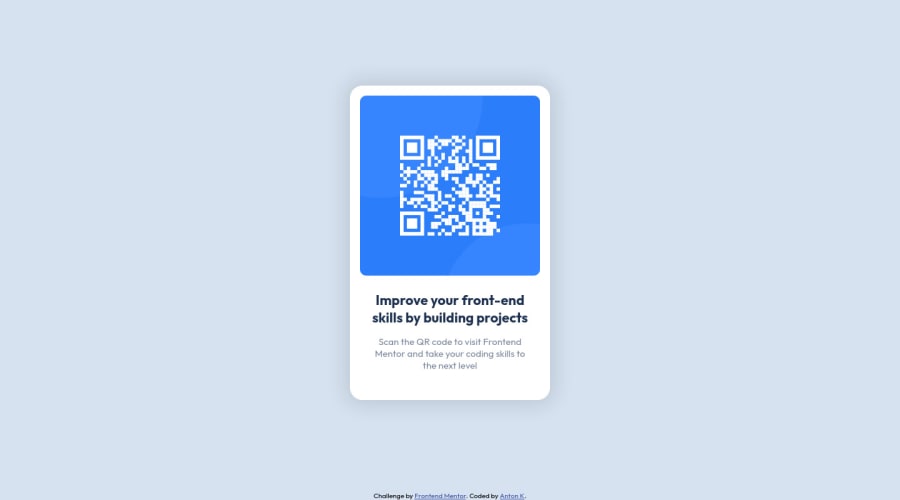
Design comparison
SolutionDesign
Solution retrospective
I'd appreciate some feedback ;)
Community feedback
- @vanzasetiaPosted almost 3 years ago
Hello, Anton! 👋
Nice work on this challenge! 👍
Two things can be done better.
- It's great that the alternative text of the QR code tells the users the exact use case of the QR code which is going to navigate the users to the Frontend Mentor site. But, I would recommend removing the word "Scan". It is not a call to action like a link or button so telling the users about the image is good enough.
- Put the attribution outside the
mainlandmark. It should live on thefooterlandmark. It's simply because the attribution is a different type of content from the card.
Hope this helps. 🙂
2 - @Pawel-GnatPosted almost 3 years ago
Good job with your challenge! Try to use rem/em in your next task, code your CSS in your css sheet only (style.css) and I'm not sure if that wrapper div was necessary here :)
Good luck :)
1
Please log in to post a comment
Log in with GitHubJoin our Discord community
Join thousands of Frontend Mentor community members taking the challenges, sharing resources, helping each other, and chatting about all things front-end!
Join our Discord
