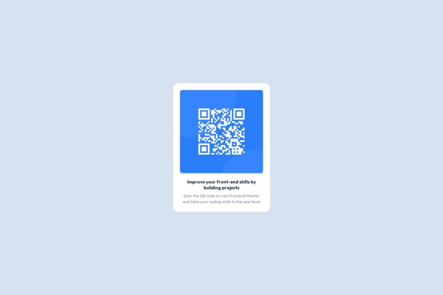
Design comparison
Please log in to post a comment
Log in with GitHubCommunity feedback
- P@khalidanejjar
-
.card img:padding: 0rem,8rem;values should not be separated by comma >padding: 0-@media (max-width: 768px): missing a closing}bracket line 59.h6, p:background-color: white;is not necessary since card is white.
Marked as helpful - P@rinta-git
If you use figma and stick to the width and height in the design, then I believe you don't have to write media queries. Also, font size looks different; use rem calculator to get the exact size from px. It is better to remove unnecessary suggestion comments included by the frontendmentor from your readme.md file and html page. So the other people who look at your code don't need to read all those.
Marked as helpful
Join our Discord community
Join thousands of Frontend Mentor community members taking the challenges, sharing resources, helping each other, and chatting about all things front-end!
Join our Discord
