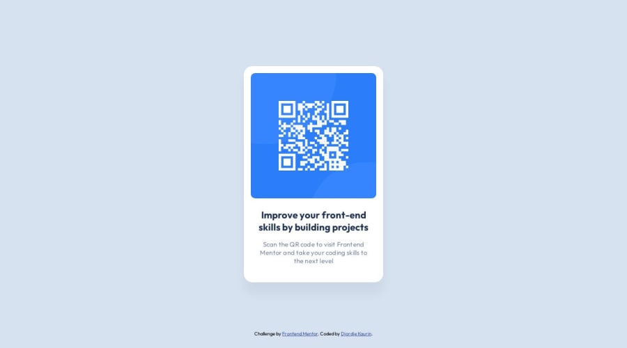
Design comparison
SolutionDesign
Community feedback
- @AGutierrezRPosted 11 months ago
Hello there 👋. Good job on completing the challenge!
I have some suggestions about your code that might interest you.
CSS and Styling:
- You could limit the text width using the
chunit, this could be a better approach than aremunit. - Implement CSS custom properties to define and utilize project colors more easily.
- Instead of fixed widths, employ
max-widthandmin-widthfor flexible and responsive design. - Let the content decide the height of the elements. Use padding and margins strategically for this purpose.
- The
bodyshould not have itsheightlimited. Instead of usingheight: 100vh, usemin-height: 100vh.
Accessibility and Semantic HTML:
- The icons/illustration images are decorative, so their alt text must be empty:
alt="".
I hope you find this helpful 😁. Most importantly, your submitted solution is fantastic!
Happy coding!
Marked as helpful1@Djole-zrPosted 11 months ago@AGutierrezR Thank you so much. This is really helpful. I hope I will be hearing more from you, on my future challenges.
0 - You could limit the text width using the
Please log in to post a comment
Log in with GitHubJoin our Discord community
Join thousands of Frontend Mentor community members taking the challenges, sharing resources, helping each other, and chatting about all things front-end!
Join our Discord
