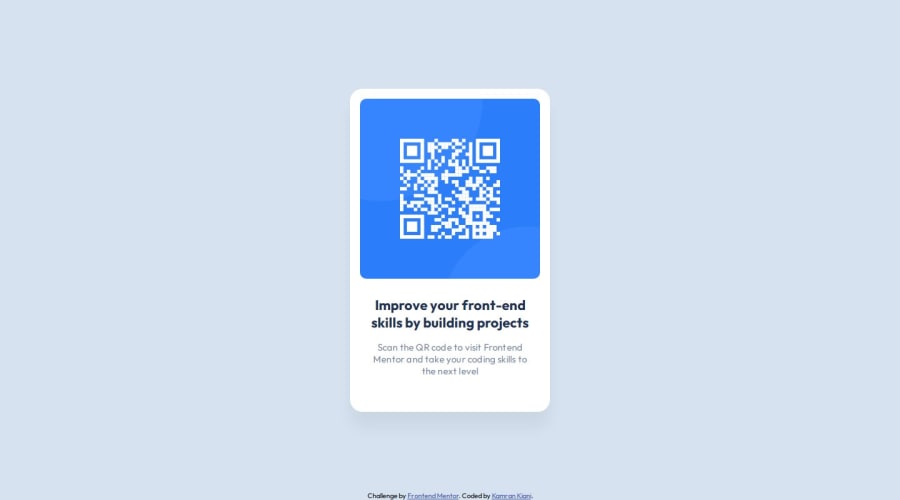
Design comparison
Solution retrospective
Centring the card on the page using flexbox
What challenges did you encounter, and how did you overcome them?- Centring the card
- Adding padding, margin and other things
- HTML structure
Community feedback
- @matbac85Posted about 1 year ago
Hey there! Just wanted to share a tip with you. If you're looking to center an element both vertically and horizontally, you can also use grids.
body {
  height: 100vh;
  display: grid;
  place-content: center;
}
You've done a great job with your component! However, I noticed that it's a bit taller compared to the model. I think there's too much white space below your text (body). You can try reducing your margin-bottom from 40px to 24px. That should do the trick! Let me know how it goes.
1@matbac85Posted about 1 year agoHey again ! @kaamiik
I'm a beginner so I make mistakes.
I suggested something "wrong" to center your component. but someone (Grace) told me this and I figured I should share with you: "I recommend using flex column for centering a component in the viewport and not grid with place content center. The reason is because with that grid approach if a user has a larger text size and views the component on a smaller screen content can overflow on the left as well as on the right, which you cannot scroll to reveal. With the flexbox approach overflow would only happen on the right meaning users could scroll to reveal that content."
You can find her complete comment on my challenge. Have a good day !
Marked as helpful0P@kaamiikPosted about 1 year agoWe are all beginners. Thank you for your very good feedback. I usually use both to practice. Initially, I was using flex and now I’m using grid and flex both. With this comment that you posted, I will use flex from now on. Also, I just read a new article, the link of which I will put down here so that we can take the footer to the bottom of the page. this was always a challenge for me :))
1@matbac85Posted about 1 year ago@kaamiik
Yes, I'm doing the same thing (using both flex and grid). Thanks for sharing this article! I'm going to take a look at it right now. I look forward to seeing more of your projects.
0 - @danilscodesPosted about 1 year ago
Hi Kamran, I'm just starting out with front-end, but you seem like you've got HTML & CSS down already! Your solution looks great! I don't really have any feedback for you, just a question: why did you use rem for font size instead of px?
0P@kaamiikPosted about 1 year agoRead this article from Grace Snow Why font-size must NEVER be in pixels @danilscodes
1
Please log in to post a comment
Log in with GitHubJoin our Discord community
Join thousands of Frontend Mentor community members taking the challenges, sharing resources, helping each other, and chatting about all things front-end!
Join our Discord
