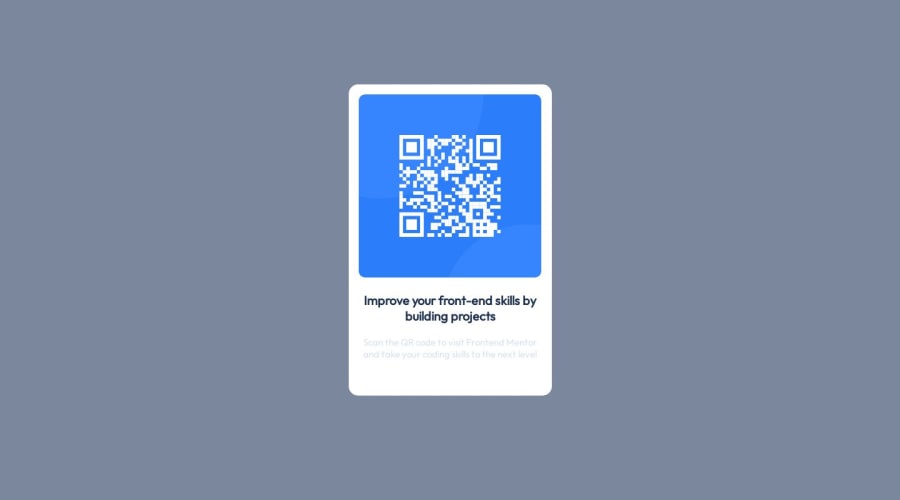
Design comparison
SolutionDesign
Solution retrospective
I dont know much about frontend, since i mostly focus in backend development
Community feedback
- @VickyAzolaPosted about 1 year ago
Hi there! 👋 Awesome job completing this challenge. Here are a few tips that may interest you:
- First it is important to use semantic HTML for accessibility purposes. Try wrapping your main content in the
<main>tag instead of a<div>tag, and use<h1>for the titles. Here you can find more information on the use of semantic HTML: link1 link2 - To use the font specified in the style-guide.md, you need to go to the link they provide and select the weights required, then copy the @import element that is created and paste it on the CSS, then specify the font-family.
- The idea is to code a solution that looks as close as possible to the design provided, so idealy the background color in this challenge should be:
hsl(212, 45%, 89%) - And the paragraph should be:
hsl(220, 15%, 55%) - Lastly, there is an easier way to center a card with Flex or Grid. Here is a good and detailed explanation of centering with CSS
Here is an example with Grid:
@import url("https://fonts.googleapis.com/css2?family=Outfit:wght@400;700&display=swap");

body {
  min-height: 100vh;
  display: grid;
  place-content: center;

  background-color: hsl(212, 45%, 89%);

  font-size: 15px;
  font-family: "Outfit", sans-serif;
}

.qr-card-body-text-secondary {
  font-weight: 400;
  color: hsl(220, 15%, 55%);
}
Hope this helps! 🤗
0 - First it is important to use semantic HTML for accessibility purposes. Try wrapping your main content in the
Please log in to post a comment
Log in with GitHubJoin our Discord community
Join thousands of Frontend Mentor community members taking the challenges, sharing resources, helping each other, and chatting about all things front-end!
Join our Discord
