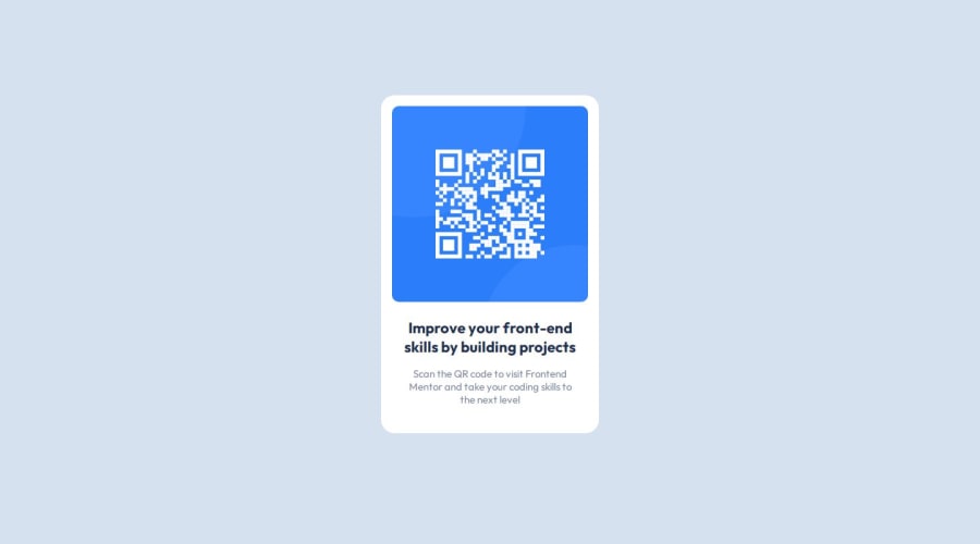
Design comparison
Solution retrospective
I think it looks pretty similar to design, so happy with that :)
What challenges did you encounter, and how did you overcome them?I struggled with vertically centering the card with flex, however I was not defining the height, once I added a 100vh it became centered.
What specific areas of your project would you like help with?I'm not sure on when to apply margin to items versus using padding. I feel like I can get same result with using either, unsure if it would be better practise to use one over the other?
Community feedback
- @Alex-Archer-IPosted 6 months ago
Hi! First of all - your solution is cool, and, yeah, quite similar to design =) Good that you are add * {margin: 0} - I always forget about it. Also you are using semantic tags which is great.
As for margin vs paddings it is really not a big deal in this example (except one thing called "margin collapse" which can be useful when you are familiar with it, but annoying at first). But when you'll stylize elements with visible borders and backgrounds padding will be needed to expand the inner space of element not for creating gaps. I mean stuff like inputs and buttons where you don't want text to stick to borders. Sorry, if you are already know about all this - I don't know on which level you are now.
As for me - I prefer flex and gap to create, well, gaps, but this is working only if you need equal gaps.
And also I want to tell you about img - it doesn't maintain it's proportions on small screen. Try to not indicate height, but only weight - it'll hold square proportions.
Well, I hope I told you something useful =) Keep doing great stuff and good luck!
Marked as helpful0
Please log in to post a comment
Log in with GitHubJoin our Discord community
Join thousands of Frontend Mentor community members taking the challenges, sharing resources, helping each other, and chatting about all things front-end!
Join our Discord