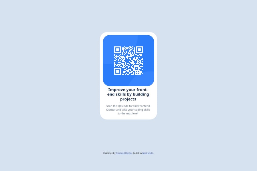
Design comparison
Solution retrospective
The completion of the project is what I'm most proud of. Something as simple as this page gave me troubles but staying level headed, I was able to figure it out to the best of my knowledge.
What challenges did you encounter, and how did you overcome them?Centering items was my biggest challenge. Figuring out the padding and and the text align was difficult to me for some reason. Once I figured out one thing I was able to space it how I needed to and kept moving from there.
What specific areas of your project would you like help with?I would like help with confirmation of what I did correctly and what I could do better in my code.
Community feedback
- @SantiagoGelvezPosted 3 months ago
Hi!
It seems that could be good project but the image link is broken and the font is not similar to the website. But, reviewing you code, there are some tips that may help you:
- Consider create a directory called css or styles. Is most common find this directory in large projects.
- In google fonts, there is a way to put the link directly into style sheet. At the begining. It seems like:
@import url('https://fonts.googleapis.com/css2?family=Outfit:[email protected]&display=swap');
- The src of your image tries to access to a directory images which actually is not placed in your project. You need to create the folder images and move the image-qr-code.png into this folder.
In sheet styles:
- Add the line
box-sizing: border-box;
to get mos similar results according the design. - Consider user em o rem instead of px to get better performance in multiple devices.
I hope you find usefull this tips and help you to achive the goals of the challenge.
0@NostromitoPosted 3 months ago@SantiagoGelvez
you helped tremendously with the image thanks you so much!! I was stuck on that for hours.
I believe I did add the font already to my html, but I scrapped css at one point and forgot to add the family back. I just fixed that but unfortunately already used all of my screenshot generates for the day.
I will look into the style sheet tips. Thanks much!
0
Please log in to post a comment
Log in with GitHubJoin our Discord community
Join thousands of Frontend Mentor community members taking the challenges, sharing resources, helping each other, and chatting about all things front-end!
Join our Discord