Not Found
Not Found
Not Found
Not Found
Not Found
Not Found
Not Found
Not Found
Not Found
Not Found
Not Found
Not Found
Not Found
Not Found
Not Found
Not Found
Not Found
Not Found
Not Found
Not Found

Submitted

QR code by Megumi

@Megumi-Nagumo

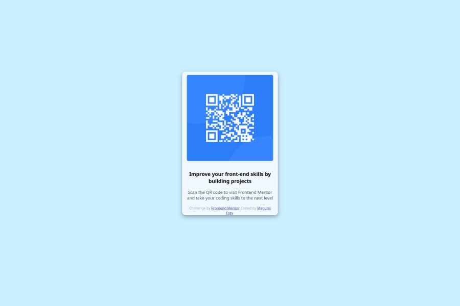
Desktop design screenshot for the QR code component coding challenge

This is a solution for...

  • HTML
  • CSS
1newbie
View challenge

Design comparison


SolutionDesign

Solution retrospective


What are you most proud of, and what would you do differently next time?

I thought it might be challenging but I could purely enjoy the process!

What challenges did you encounter, and how did you overcome them?

It took me a bit to figure out how to center the image in html but I could solve the issue by using "transform: translate(0, 50%);"

What specific areas of your project would you like help with?

JS knowledge.

Community feedback

@ArslanAIENGR

Posted

Hi!

Congrats on completing this project.

Things to improve here.

I suggest adding a bit of padding to your body element so the card has some space around it on smaller viewports.

Try experimenting with the CSS layout tool Flexbox, it will help you greatly structuring elements on your webpage.

You could add a min-height: 100vh to your body element so it takes up the full height of the viewport while still being able to grow when the content inside it grows.

Try experimenting with CSS variables, they help you make your CSS values more reusable across your code.

I suggest using clear descriptive CSS classes like .card, .card-title and .card-description.

Try using semantic HTML elements like main, section and article.

Try using using relative CSS units like rem and em they make your layout more adaptable.

Be careful with setting a fixed width and height on your elements. If the content in these elements grows beyond these restrictions you’ll run into overflow issues. Keeping the height at auto - which block elements are by default - will be fine in most cases.

Try styling your elements using classes instead of ID’s. Most of the time they are the better choice. ID’s are mostly used to select elements using JavaScript, navigation on the page itself and to style unique elements.

you can get assistance by contacting me on email: [email protected] I will feel happy to help you okay thanks

Marked as helpful

0

@Megumi-Nagumo

Posted

@ArslanAIENGR Thank you so much for having looked at my code and your comment! I will practice more and learn to code with flexibility. :)

0

@ArslanAIENGR

Posted

@Megumi-Nagumo Good Job

0
Lyna 260

@lynaIFR

Posted

Congrats on completing this project! At first glance, it seems you didn't see the design guide provided in the project folder, I invite you to take a look at it to better understand the requirements, I also took a look at your code, you should know that the attribution shouldn't be in the card (you can also take it off your website if you want), I invite you to check Josh Comeau for CSS reset, there is no need for the id; you can use other tags like h for the first p, using values for the padding and margin can be chaotic at some point, try flex box or grid and let the browser center elements for you If you have questions I'll be happy to help !

0

@Megumi-Nagumo

Posted

Hi @lynaIFR! Thank you so much for having looked at my code and your comment! yes, after coming across this platform, I just went straight to the project without reading through the guide ^ ^; I've just started to learn programming a few months ago. I will practice more and learn to code with flexibility. :)

0

@DylandeBruijn

Posted

@Megumi-Nagumo

Hiya! 👋

Congratulations on your solution, it looks very close to the design! I can tell you put a lot of effort into it.

Things you could improve ✍️

  • I suggest adding a bit of padding to your body element so the card has some space around it on smaller viewports.

  • Try experimenting with the CSS layout tool Flexbox, it will help you greatly structuring elements on your webpage.

  • You could add a min-height: 100vh to your body element so it takes up the full height of the viewport while still being able to grow when the content inside it grows.

  • Try experimenting with CSS variables, they help you make your CSS values more reusable across your code.

  • I suggest using clear descriptive CSS classes like .card, .card-title and .card-description.

  • Try using semantic HTML elements like main, section and article.

  • Try using using relative CSS units like rem and em they make your layout more adaptable.

  • Be careful with setting a fixed width and height on your elements. If the content in these elements grows beyond these restrictions you’ll run into overflow issues. Keeping the height at auto - which block elements are by default - will be fine in most cases.

  • Try styling your elements using classes instead of ID’s. Most of the time they are the better choice. ID’s are mostly used to select elements using JavaScript, navigation on the page itself and to style unique elements.

I hope you find my feedback helpful! 🌟

Let me know if you have more questions and I'll do my best to answer them. 🙋‍♂️

Happy coding! 😎

0

@Megumi-Nagumo

Posted

Hi @DylandeBruijn, thank you so much for having looked at my code and your detailed comment! I really appreaciate it. I will work on structuring more by trying other projects. I would be happy if you would take a look at them :D Merci

0

Please log in to post a comment

Log in with GitHub
Discord logo

Join our Discord community

Join thousands of Frontend Mentor community members taking the challenges, sharing resources, helping each other, and chatting about all things front-end!

Join our Discord