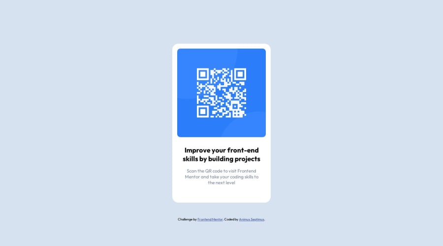
Design comparison
Solution retrospective
Align center using flexbox and height styling of html and body tags.
What challenges did you encounter, and how did you overcome them?Community feedback
- @Islandstone89Posted 11 months ago
HTML:
- The text in the footer must be wrapped in a
<p>.
CSS:
-
It's good practice to include a CSS Reset at the top.
-
Remove the
heightonhtml. -
Change
heightonbodytomin-height: 100vh. -
box-sizing: border-boxshould be set on*. -
bodyshould not have amax-width. -
Remove
font-style: normal, as that is the default value. -
The card must not have a fixed width. Instead, add a
max-widthof around20rem- this prevents the card from getting too wide on larger screens. -
As you have set
box-sizing: border-boxhigher up in the DOM, it is already inherited bymain- hence there is no need to declarebox-sizing: inherit. -
On the image, add
display: blockand replacewidthwithmax-width: 100%- the max-width prevents it from overflowing its container. -
Since all text should be centered, you only need to set
text-align: centeron the body, and remove it elsewhere. The children will inherit the value. -
font-sizemust never be in px. This is bad for accessibility, as it prevents the font size from scaling with the user's default setting in the browser. Use rem instead. -
On the paragraph, remove
font-family: 'Outfit',font-weight: 400andfont-style: normal. Thefont-familyis inherited from thebody, and the two other properties are default values of a paragraph. It should also not have a fixed width. To limit the length of the text, usepadding-inlineor amax-widthof around25ch.
Marked as helpful1 - The text in the footer must be wrapped in a
Please log in to post a comment
Log in with GitHubJoin our Discord community
Join thousands of Frontend Mentor community members taking the challenges, sharing resources, helping each other, and chatting about all things front-end!
Join our Discord
