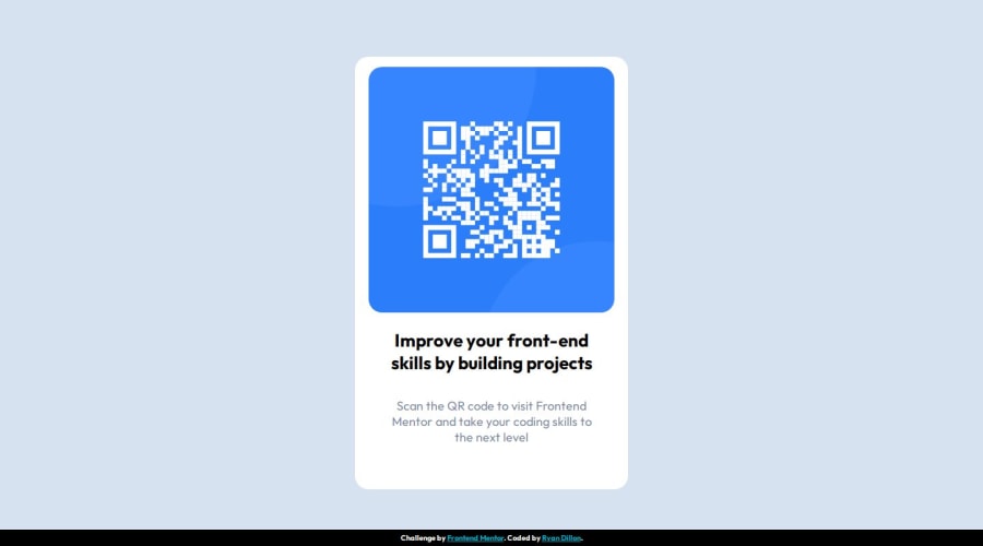
Design comparison
Solution retrospective
Had to check against live site instead of live server. Will do this more often before submitting solution.
What challenges did you encounter, and how did you overcome them?Upscaling was a nightmare. Definitely need more practice.
What specific areas of your project would you like help with?Ways to upscale easier.
Community feedback
- @danielmrz-devPosted 7 months ago
Hello there!
Congrats on completing the challenge! ✅
Your solution looks great!
I have a suggestion for improvement:
📌 Think about using
<main>to wrap your main content instead of<div>.Imagine
<div>and<span>in HTML as basic containers. They're good for holding stuff, but they don't tell us much about what's inside or its purpose on the webpage.This change might not have impact on how your page looks, but it'll make your HTML code clearer and help with SEO and accessibility.
Hope that's helpful!
Keep up the great work!
Marked as helpful0@RyanDillon94Posted 7 months ago@danielmrz-dev Thanks for your suggestion... I had completely forgotten about <header> and <main> tags! Thank you!
0
Please log in to post a comment
Log in with GitHubJoin our Discord community
Join thousands of Frontend Mentor community members taking the challenges, sharing resources, helping each other, and chatting about all things front-end!
Join our Discord
