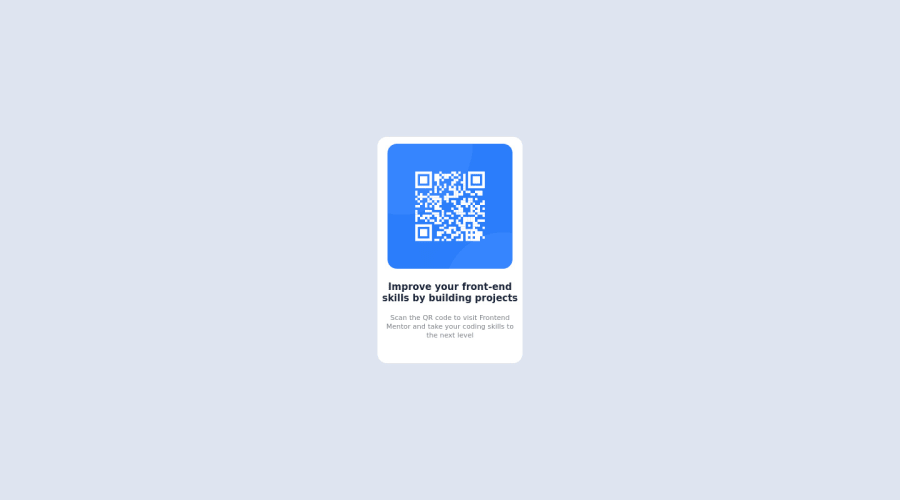
Design comparison
Solution retrospective
A better idea on how I can improve will be appreciated
Community feedback
- @correlucasPosted about 2 years ago
👾Hello Oluwatosin , congratulations for your new solution!
👨💻 Here’s some tips to improve your solution code:
1.Remove the
background-color: #dee5f1;from the container and add it tobodyto make it filling all the screen bg:.cover { max-width: 320px; /* height: 100%; */ position: absolute; /* background-color: #dee5f1; */ overflow: hidden; display: flex; justify-content: center; align-items: center; }You tried to align the component using
marginsbut this make this task really tricky and hard control all the content. My advice for you is to useflexboxto create this alignment. First thing you've to do is to addmin-height: 100vhto make sure your body will be displaying minimum 100% of the view-port height (this will help the card be ever aligned vertically centered) and then adddisplay: flex; align-items: center; justify-content: center;to make the alignment:body { background-color: #dee5f1; padding: 0; margin: 0; box-sizing: border-box; font-family: 'Outfit', sans-serif; min-height: 100vh; display: flex; align-items: center; justify-content: center; }✌️ I hope this helps you and happy coding!
Marked as helpful0
Please log in to post a comment
Log in with GitHubJoin our Discord community
Join thousands of Frontend Mentor community members taking the challenges, sharing resources, helping each other, and chatting about all things front-end!
Join our Discord
