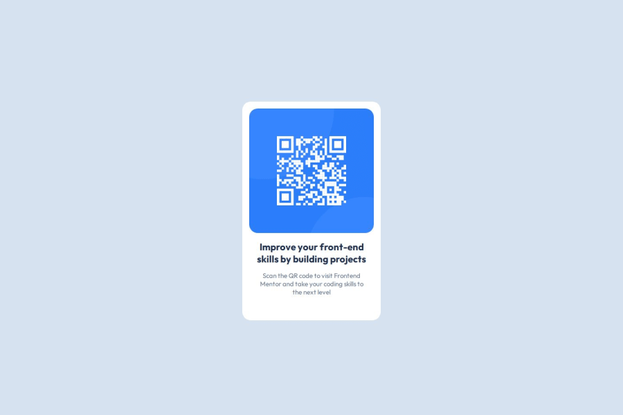
Design comparison
Community feedback
- @Islandstone89Posted 2 days ago
HTML:
-
Every webpage needs a
<main>that wraps all of the content, except for<header>andfooter>. This is vital for accessibility, as it helps screen readers identify a page's "main" content. Change.containerto a<main>. -
You don't need to wrap the image or the text in a
<div>. -
The image is important content and must be set in the HTML. Remember to add a short description for screen readers:
<img src="images/image-qr-code.png" alt="QR code leading to the Frontend Mentor website." >- I would change the heading to a
<h2>- a page should only have one<h1>, reserved for the main heading. As this is a card heading, it would likely not be the main heading on a page with several components.
CSS:
-
Including a CSS Reset at the top is good practice.
-
Move
font-familyfrom*tobody. -
I recommend adding a bit of
padding, for example16px, on thebody, to ensure the card doesn't touch the edges on small screens. -
On the
body, changeheighttomin-height: 100svh- this way, the content will not get cut off if it grows beneath the viewport. -
Remove all widths and heights in
px. We rarely want to give a component a fixed size, as we need it to grow and shrink according to the screen size. -
We do want to limit the width of the card, so it doesn't get too wide on larger screens. To solve this issue, give the card a
max-widthof around20rem. -
font-sizemust never be in px. This is a big accessibility issue, as it prevents the font size from scaling with the user's default setting in the browser. Use rem instead. -
Since all of the text should be centered, you only need to set
text-align: centeron the body, and remove it elsewhere. The children will inherit the value. -
On the image, add
display: block,height: autoandmax-width: 100%- the max-width prevents it from overflowing its container. Without this, an image would overflow if its intrinsic size is wider than the container.max-width: 100%makes the image shrink to fit inside its container. -
Add around
20pxofborder-radiusto give the image rounded corners.
0 -
- @delfinjfbPosted 3 days ago
Hola Maria, First solution. Congratulations. It looks great. Keep going with he next challenge.
Please, dont forget the meta tags:
- Your page does not have a meta description
All the rest can go great. Have a great week
0@mnazarethgPosted 2 days ago@delfinjfb thanks for Your feedback. I'll add a meta description. Hope your week goes great too!
0
Please log in to post a comment
Log in with GitHubJoin our Discord community
Join thousands of Frontend Mentor community members taking the challenges, sharing resources, helping each other, and chatting about all things front-end!
Join our Discord
