Solution retrospective
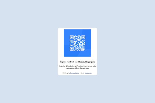
I am most proud of successfully creating a functional and visually appealing page, even though it was a simple project. It was rewarding to see the QR code integrated correctly and working as expected, something that can be practically applied in various scenarios. Additionally, it was a great opportunity to practice front-end development and design skills.
Next time, I would focus more on enhancing the visual design of the page, making it more attractive and responsive across different devices. I could also explore adding extra features, such as dynamic QR code customization based on user-provided data.
What challenges did you encounter, and how did you overcome them?One of the main challenges I encountered was ensuring the QR code generated correctly and could be scanned without any issues. To overcome this, I carefully tested it on multiple devices and used a reliable QR code generation library. Another challenge was aligning the design of the page to make it both simple and functional. I addressed this by experimenting with different layouts and styles until I achieved a clean and user-friendly result. Additionally, managing time efficiently was a bit challenging, but I tackled it by breaking down the project into smaller tasks and focusing on one step at a time.
What specific areas of your project would you like help with?I would like feedback on how to improve the responsiveness of the page, ensuring the layout adjusts seamlessly across different devices and screen sizes. Additionally, if there are any suggestions for optimizing the QR code integration or enhancing the user interface design to make it more visually appealing, I would greatly appreciate them. Finally, I’d be interested in learning about best practices for organizing my code and keeping the project scalable for future updates.
Please log in to post a comment
Log in with GitHubCommunity feedback
No feedback yet. Be the first to give feedback on TobiasJunior's solution.
Join our Discord community
Join thousands of Frontend Mentor community members taking the challenges, sharing resources, helping each other, and chatting about all things front-end!
Join our Discord