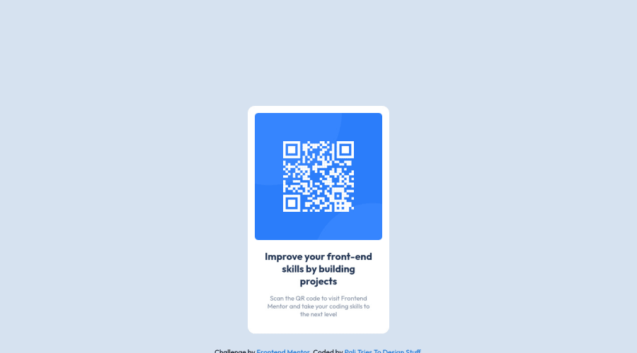
Design comparison
Solution retrospective
Is it needed to put the image inside a div? It still confuses me a bit.
I feel like I'm learning something. It only took me about 20 minutes to build it.
Thanks!
Community feedback
- @TechNechPosted about 3 years ago
Hope you are doing good. I would suggest you these few quick fixes on your component site.
-
In your
.containeryou don't need that much ofmarginyou can do is to simplify that property tomargin: 0 auto -
Then add these properties
height: 100vh; display: flex; flex-direction: column; justify-content: center;to yourbodycss, which will center your component. -
In
.qr-textsimplifypadding: 1rem; -
In your
.qr-text__paddmax-width: 25ch;
Marked as helpful1@PaliTriesToDesignPosted about 3 years ago@TechNech I really appreciate your help. Thanks!
0@TechNechPosted about 3 years ago@PaliTriesToDesign Anytime! I would love to see those changes on the live site. Make those changes and push it on github.
Happy coding :)
0 -
Please log in to post a comment
Log in with GitHubJoin our Discord community
Join thousands of Frontend Mentor community members taking the challenges, sharing resources, helping each other, and chatting about all things front-end!
Join our Discord
