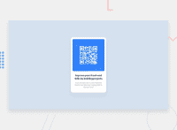
Design comparison
Community feedback
- @PhoenixDev22Posted over 2 years ago
Greeting @romuloqueiroz ,
Congratulation on completing your Frontend mentor challenge,
I have few suggestions regarding your solution:
-
<header>and<main>are intended to be at the same level of hierarchy in the page (one level below<body>). Nesting one inside the other would therefore not be recommended. -
You can use
<footer>landmark for the attribution. -
Page should contain a level-one heading . As this is not a real webpage , you can use
<h1>withclass="sr-only"(Hidden visually, but present for assistive tech) -
The alternative text should be human-readable(not capitalised ) ex : **QR code for frontend mentor **
-
To center the card on the middle of the page , you can use the flexbox properties and
min-height: 100vhfor the<body>.add a little the margin: 1rem;
body { display: flex; align-items: center; justify-content: center; min-height: 100vh; }- In
line-height: 25px;use unitless value for theline-height, this is the preferred way to set line-height and avoid unexpected results due to inheritance.Read more in MDN. - In
width: 330px;Consider usingmax-width:20reminstead, Then add a little margin on the component or padding on the body to stop it hitting screen edges. That will let it shrink a little when it needs to.
-
height: 530px;It's rarely ever a good practice to set heights on elements, you almost never want to set it . let the content define the height .-
It's recommended to use
emandremunits .Bothemandremare relative units , Usingpxwon't allow the user to control the font size based on their needs. -
It's recommended not to use
pxfor font-size.You can use rem instead .
Overall , your solution is good. Hopefully this feedback helps.
0 -
- @denieldenPosted over 2 years ago
Hi Rômulo, I took some time to look at your solution and you did a great job!
Also I have some tips for improving your code:
- remove all
marginfromcardclass - try to use flexbox to the body for center the card. Read here -> best flex guide
- after, add
min-heigth: 100vhto body because Flexbox aligns child items to the size of the parent container
Overall you did well :)
Hope this help and happy coding!
0 - remove all
Please log in to post a comment
Log in with GitHubJoin our Discord community
Join thousands of Frontend Mentor community members taking the challenges, sharing resources, helping each other, and chatting about all things front-end!
Join our Discord

