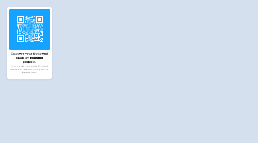
Design comparison
Solution retrospective
So I'm new at this and I tried to do the challenge and I would like to know how I can improve. I feel I have written a lot of unnecessary lines but I can't say for sure what they are. I used to program in C# but front-end is quite new to me. How can I make the code smaller?
Community feedback
- @ziy-egPosted over 2 years ago
instead of
<body>
    <section>
      <div class='box'>
        <section class = 'box1'>
        <a href="https://imgbb.com/"><img src="https://i.ibb.co/vkFLCm7/frame.png"></a>
    </section>
        <h2>Improve your front-end skills by building projects.</h2>
    <p class='description'> Scan the QR code to visit Frontend
    Mentor and take your coding skills to the next level. </p>
    </div>
    </section>
</body>
Try using:
<body>
    <main class="box">
        <div class ="qr-code">
            <a href="https://imgbb.com/">
                <img src="https://i.ibb.co/vkFLCm7/frame.png">
            </a>
        </div>
        <h2>Improve your front-end skills by building projects.</h2>
        <p class="description">
            Scan the QR code to visit Front-end Mentor and take your coding skills to the next level.
        </p>
    </main>
</body>
it's much easier.
as for centering the card:
.box {
     position: absolute;
     top: 50%;
     left: 50%;
     transform: translate (-50%, -50%);
}
Marked as helpful1 - @AlexWesleyyPosted over 2 years ago
The most visible problem is in the matter of centering the card, try using the display flex property in the container, to better position your elements. If you have any questions, you can check it out in my repository: https://github.com/AlexWesleyy/QR-code-component or just call, I can help with whatever I can! For those just starting out, you are on the right track.
Marked as helpful1@albarbsilvaPosted over 2 years ago@AlexWesleyy thank you!!! I will be putting this into practice and I'll be looking at your repository :)
1
Please log in to post a comment
Log in with GitHubJoin our Discord community
Join thousands of Frontend Mentor community members taking the challenges, sharing resources, helping each other, and chatting about all things front-end!
Join our Discord
