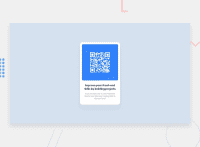
Design comparison
SolutionDesign
Community feedback
- @denieldenPosted almost 2 years ago
Hello Nilesh, You have done a good work! 😁
Some little tips to improve your code:
- add
maintag and wrap the card for improve the Accessibility - also you can use
articletag instead of a simpledivto the container card for improve the Accessibility - add descriptive text in the
altattribute of the images - remove all unnecessary code, the less you write the better as well as being clearer: for example the
divcontainer of image - remove all
marginfrom.containerclass because with flex they are superfluous and addwidth: 20rem - add
width: 100%toimgtag and removebackground and borderproperties because not necessary - use flexbox property
align-items: center and flex-direction: columnto the body to center the card. Read here -> best flex guide - use
min-height: 100vhto body instead ofheight, otherwise the content is cut off when the browser height is less than the content - instead of using
pxuse relative units of measurement likerem-> read here
Keep learning how to code with your amazing solutions to challenges.
Hope this help 😉 and Happy coding!
0 - add
Please log in to post a comment
Log in with GitHubJoin our Discord community
Join thousands of Frontend Mentor community members taking the challenges, sharing resources, helping each other, and chatting about all things front-end!
Join our Discord

