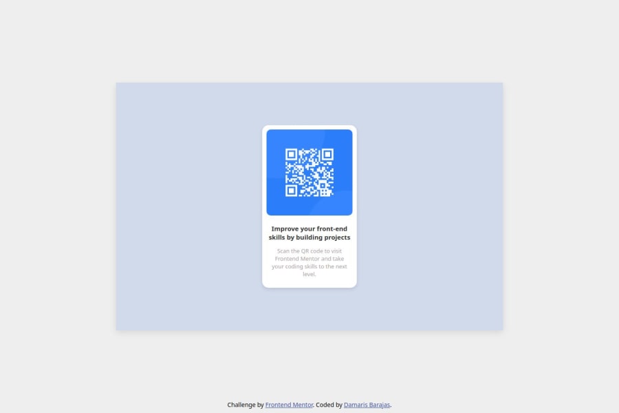
Design comparison
Solution retrospective
I’m proud of successfully implementing a clean and responsive design that closely matches the given challenge. I ensured the layout was well-structured using semantic HTML and CSS, and I’m especially happy with how I used flexbox/grid to center the QR code properly.
What challenges did you encounter, and how did you overcome them?One challenge I faced was centering the QR code container properly on the page. Initially, I struggled with making it responsive while keeping it perfectly aligned. I overcame this by using flexbox and ensuring that both the body and container had the correct height and alignment properties.
What specific areas of your project would you like help with?Is my HTML and CSS well-organized and easy to maintain? Are there any areas where I could improve my class naming conventions or file structure?
Community feedback
- @Axsel519Posted 26 days ago
good work but you should change this
.container { width: 90%; max-width: 900px; min-height: 60vh; /* background: #d0daeb; / delete display: flex ; justify-content: center; align-items: center; position: relative; / box-shadow: 0 5px 15px rgba(0, 0, 0, 0.1); */ delete }
Marked as helpful0@DamarisMBPosted 26 days ago@Axsel519 thank you! Really appreciate your feedback. I will make sure to update that.
0
Please log in to post a comment
Log in with GitHubJoin our Discord community
Join thousands of Frontend Mentor community members taking the challenges, sharing resources, helping each other, and chatting about all things front-end!
Join our Discord
