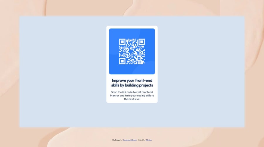


Design comparison

Solution retrospective
Hi, Could anyone help me understand how we can create this website for a mobile version? Do we used media queries? In the readme file it mentions that the designs were created to the following widths:
- Mobile: 375px
- Desktop: 1440px I have just coded for a desktop version.
Community feedback
- @KlonnisterPosted almost 2 years ago
Hello! I hope you're doing fine. Your solution looks good, though regarding to your question, here are some recommendations that I think might help :).
Regarding to responsiveness, for this exercise you don't need to use any media queries as the component is small and it doesn't change for the desktop version. But here's a tip to make your website adapt to any screen sizes:
First I'd recommend setting all elements' box sizing to border box:
* {
box-sizing: border-box
}
A brief explanation of what this does is that any element with border box set will respect its size regardless of the padding or margin you add and a scroll bar won't appear. You can read more about it in W3Schools CSS Box Sizing
Then, I'd advise to delete the div with class "outer", and style your body tag instead to make it occupy the whole screen and center your component:
body {
max-width: 100%;
min-height: 100vh;
display: flex;
justify-content: center;
align-items: center;
background-color: hsl(212, 45%, 89%);
}
Then <body> will always ocuppy 100% of width and 100% of the viewport height. Then, display flex will do the job of centering your component regardless of the screen size.
Here are a some links that can help you understand this better:
Now regarding to accessibility, I think you did great by adding an <h1> as it describes the title of the page and every page needs one. The only thing that I'd say you can improve is to add a main tag. The main tag basically tells the browser or screen readers what is the main content of the page.
You can change the tag <div> with class "whitediv to <main> and keep all attributes and classes on it.
<main class="whitediv" style="background-color: hsl(0, 0%, 100%);">This is called semantic HTML. Here are some links to read more about accessibility and Semantic HTML
I know it is a lot, just take your time reading and practicing with them, you'll see it'll be easy peasy. Anyways, I hope I was helpful, happy coding!
Marked as helpful0@MeghaS4831Posted almost 2 years agoThanks @Klonnister ! Your inputs helped. I have read a bit about accessibility and was actually wondering if I should use <main> as it was relatively a basic design. But, yes I will try to incorporate it going further irrespective of the site size.
0@KlonnisterPosted almost 2 years ago@MeghaS4831 You're welcome! And sounds good, happy coding;)
0 - @itushPosted almost 2 years ago
Congratulations on completing the challenge! 🎉
Welcome to the platform! 🎉 We're thrilled to have you here and excited to see your progress 💪as you continue your front-end development journey.
Your solution looks nice to me :)
-
To make it mobile responsive it is important to first understand how the breakpoints work with the media queries, which breakpoints to target etc.
-
To reset default browser styles you may also add
box-sizing: border-box;
In my projects:
- I always start with mobile-first workflow.
- I use at least one main element for a page (entire content goes into the main, if I'm not using header & footer), and avoid divs as much as possible and use section and article element wherever I can.
<body> <main> All content </main> </body>- I Use relative units as much as possible and avoid absolute units whenever possible.
- If you are someone who is just starting out with front-end development, I strongly suggest starting with the QR code component project(which you did). Also in the challenges page you may filter by (Newbie, HTML&CSS) sort by (easier first) to select projects that will help you solidify your foundation. To avoid any potential knowledge gap⚠️ please first solidify HTML, CSS, JS fundamentals and then move on to any framework or library.
- I remember when I started out, I made countless mistakes and spent long hours searching for solutions. But hey, you don't need to go through the same struggles! 🙌 To help you shorten the learning curve, I recommend going through the following articles. They contain valuable insights that can make your journey smoother:
📚🔍 12 important CSS topics where I discuss about css position, z-index, box-model, flexbox, grid, media queries, mobile-first workflow, best practices etc. in a simple way.
📚🔍 11 important HTML topics where I discuss about my thought process and approach to convert a design/mock-up to HTML along with important topics like block and inline elements, HTML Semantic Elements.
I hope you find these resources helpful in your coding adventures! 🤞
I'm eagerly looking forward to seeing the amazing projects you'll create in the future! 🚀💻
Keep up the fantastic work and happy hacking! 💪✨
Marked as helpful0@MeghaS4831Posted almost 2 years agoThank you for your inputs! @itush
Since I started, I have been attempting to limit the usage of div and use the new semantic HTML5 elements. But <div> ends up easier to style at least at this stage for me.
Going forward, I will be writing the code as suggested by you and @Klonnister. :)
1@itushPosted almost 2 years ago@MeghaS4831
You are most welcome!
I totally understand the issue with divs, and it is mentioned in my HTML article. We all have to go through the "DIV DILEMMA" after all😁
With practice you'll improve.
BTW: It would motivate me to provide quality support like this to the community, if you could spare a moment and give my GitHub pinned projects a ⭐️ star.
Marked as helpful0 -
- @vivekrajput-93Posted almost 2 years ago
Hi...Congrats..on first project...Yeah u can media queries to make responsive for every device by setting (max-width: any(px) you want...and select the tag(here <img>) u want to target for make it responsive...I hope I was usefull.
0 - @Hna456Posted almost 2 years ago
Yeah to make the site responsive( suitable for every device), we use media queries and if u r using tailwindcss u can use break points. As for ur code, the image isn't working so u should check it again and make sure it works.
0@MeghaS4831Posted almost 2 years ago@Hna456 Thanks! I checked, it works now. For some reason, it was not showing me the image sometime back too!
0


Please log in to post a comment
Log in with GitHub
Join our Discord community
Join thousands of Frontend Mentor community members taking the challenges, sharing resources, helping each other, and chatting about all things front-end!
Join our Discord