Design comparison
Solution retrospective
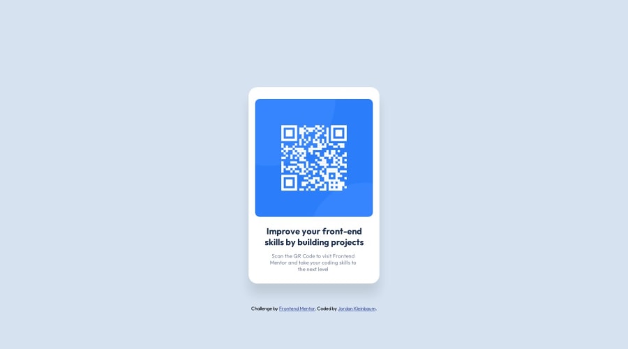
Question: I have an issue with CSS position, the way I centered my "card" div was by adding display: flex, align items and justify content to the entire body of the HTML Document. What is the best practice / easiest way to center the div, as well as center the text within the card?
Thank you!
Community feedback
- @MarioMinchevskiPosted over 1 year ago
Heya!
Congratulations on solving your first challenge!
Regarding the placement of your card in the center of the screen, you can also use
display: grid; place-content: center;
If this does not work, just set the body min-height: 100vh and it will be working for sure. It's a bit less code than using flex :)
Hope this helps, happy coding!
0 - @LuisJimenez19Posted over 1 year ago
Hello, congratulations on finishing the challenge.
As you have done it is fine, if you do not want to add the style to the
body
then create another element that contains everything, but for this project it is fine.It is always best to manipulate the content from its container. You can add the height to the
body
or to themin-heigth:100vh
container element and with theflex
rules you've added it should be perfectly centered so you don't use themargin
on the card.Another way to do that and with one less line is to use grid:
body { background-color: hsl(212, 45%, 89%); display: flex; min-height: 100vh; display: grid; place-content: center; }
I hope my contribution is helpful, do not hesitate to ask if you have another question. 👋🏽
0 - @Miracle656Posted over 1 year ago
try this div { width: 300px; height: 300px; background-color: red; position: absolute; top: 50%; left: 50%; transform: translate(-50%, -50%); }
0
Please log in to post a comment
Log in with GitHubJoin our Discord community
Join thousands of Frontend Mentor community members taking the challenges, sharing resources, helping each other, and chatting about all things front-end!
Join our Discord