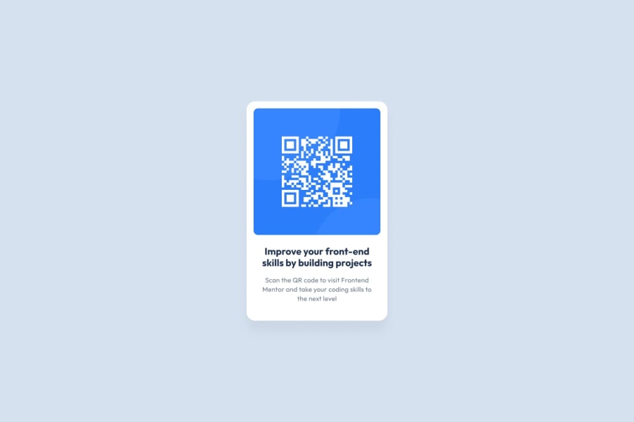
Design comparison
SolutionDesign
Solution retrospective
What are you most proud of, and what would you do differently next time?
I am most proud of how i was able to center the qr code to the middle of the screen.
Community feedback
- @MrLanterPosted 3 months ago
Hi! Your project is visually well done and I think you could improve on a few points:
- the border-radius of the white box could be better connected to the image (a smaller number of px)
- a small space between the box and the attribution text
- the font-family on the title does not seem to match and the color either, and I think it is a problem with the import of the font-family. In the example we use a font from Google Fonts so you can watch a way to do it on youtube to find the import link. Try this line and it should work:
@import url('https://fonts.googleapis.com/css2?family=Outfit:[email protected]&display=swap');
And regarding the code, it looks pretty well structured but maybe you could add a
<main></main>to wrap the main code?I hope these suggestions are useful to you. Your project is very cool and well designed. Have a nice day 😊
0
Please log in to post a comment
Log in with GitHubJoin our Discord community
Join thousands of Frontend Mentor community members taking the challenges, sharing resources, helping each other, and chatting about all things front-end!
Join our Discord
