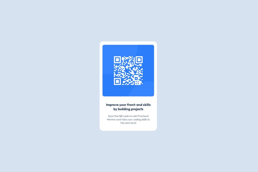
Design comparison
SolutionDesign
Community feedback
- @BrianMunizSilveiraPosted 5 months ago
Code Review and Suggestions
Positive Highlights:
- Clean and Simple Design: The code effectively uses flexbox for layout and keeps the styles minimalistic yet functional.
- Font Import: Correct use of Google Fonts ensures a polished typography style.
- Responsive Approach: The centering of the main content ensures a good base for responsiveness.
Suggested Improvements:
1. HTML Structure
- Heading Tag Mismatch: The
<h3>tag should close with</h3>, not</h1>. This mismatch could cause rendering or SEO issues.
<h3>Improve your front-end skills by building projects</h3>- Alt Text Description: Improve the
alttext to be more descriptive for accessibility.
<img src="./images/image-qr-code.png" alt="QR code linking to Frontend Mentor website">
2. CSS Adjustments
- Font Family Declaration: Update the
font-familydeclaration to include fallbacks and match the imported font name.
body { font-family: "Outfit", sans-serif; }- Use Variables for Colors: Define colors in CSS variables to ensure consistency and ease of updates.
:root {
    --bg-color: hsl(212, 45%, 89%);
    --text-color: hsl(216, 15%, 48%);
    --heading-color: hsl(218, 44%, 22%);
    --container-bg: #fff;
}
body {
    background-color: var(--bg-color);
}
h3 {
    color: var(--heading-color);
}
p {
    color: var(--text-color);
}
3. Accessibility
- Semantic Improvements: Wrap the
<section>in an<article>tag for better semantics since it represents standalone content.
<article>
    <section class="container">
        <img src="./images/image-qr-code.png" alt="QR code linking to Frontend Mentor website">
        <div class="text">
            <h3>Improve your front-end skills by building projects</h3>
            <p>Scan the QR code to visit Frontend Mentor and take your coding skills to the next level.</p>
        </div>
    </section>
</article>
4. Performance Enhancements
- Preload Key Assets: Preload critical resources like fonts and images to improve loading speed.
<link rel="preload" href="./images/image-qr-code.png" as="image"> <link rel="preload" href="https://fonts.googleapis.com/css2?family=Outfit:wght@400;700&display=swap" as="style">- Optimize Image Size: Ensure the QR code image is optimized for its displayed dimensions (288px × 288px) to reduce loading time.
5. Responsiveness
- Add media queries for smaller screen sizes to ensure the container adjusts appropriately.
@media screen and (max-width: 480px) {
    .container {
        width: 90%;
        padding: 20px;
    }
    img {
        width: 100%;
        height: auto;
    }
}
6. Consistency and Maintainability
- Remove Unnecessary Properties: The
margin-top: auto;andmargin-left: auto;in thebodystyles are redundant sinceflexboxcentering handles alignment.
body {
    background-color: var(--bg-color);
    font-family: "Outfit", sans-serif;
    display: flex;
    justify-content: center;
    align-items: center;
    height: 100vh;
}
Summary
This is a solid implementation with good design principles. The suggested changes will improve accessibility, maintainability, and responsiveness while optimizing performance. Keep up the great work!
0
Please log in to post a comment
Log in with GitHubJoin our Discord community
Join thousands of Frontend Mentor community members taking the challenges, sharing resources, helping each other, and chatting about all things front-end!
Join our Discord
