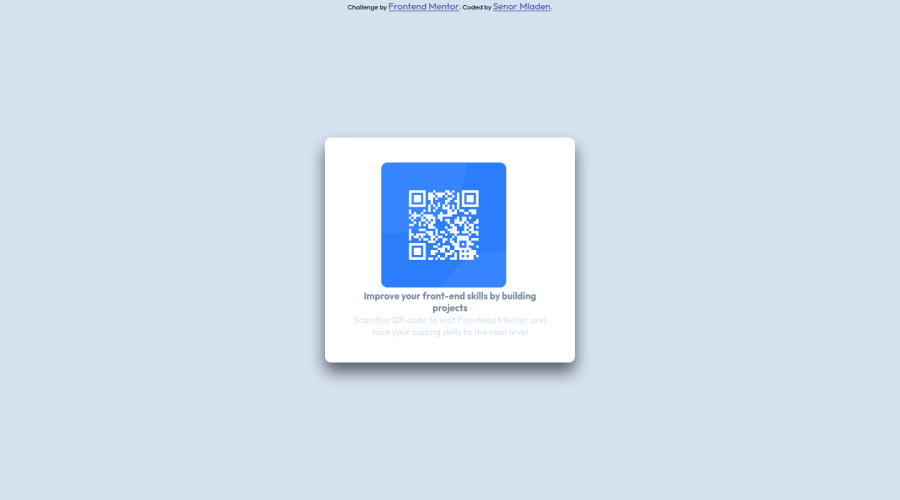
Design comparison
SolutionDesign
Please log in to post a comment
Log in with GitHubCommunity feedback
- @Samadeen
Hey!! Cheers 🥂 on completing this challenge.. .
Here are my suggestions..
- You should use <main class="container"> instead of <div class="container">.
- Go down orderly when you are using the headings h1 down to h2 down to h3 and so on.
- You can wrap your attribution section in a footer tag to avoid accessibility issues.
This should fix most of your accessibility issues
. Regardless you did amazing... hope you find this useful... Happy coding!!!
Marked as helpful - @FahimEcho
wow. great work
Join our Discord community
Join thousands of Frontend Mentor community members taking the challenges, sharing resources, helping each other, and chatting about all things front-end!
Join our Discord
