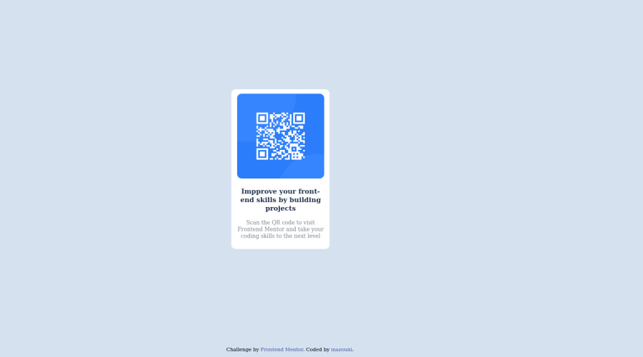
Design comparison
Community feedback
- @MelvinAguilarPosted almost 2 years ago
Hello there 👋. Good job on completing the challenge !
I have some suggestions about your code that might interest you.
Font:
-
You did not use the fonts of the challenge, there are two methods to import font family:
1. Using a <link> tag: The <link> tag allows you to import a font from an external source and use it on your website. To use this method, you need to have the font file saved on your server or an external source such as Google Fonts.
Example:
<link rel="preconnect" href="https://fonts.googleapis.com" />
<link rel="preconnect" href="https://fonts.gstatic.com" crossorigin />
<link href="https://fonts.googleapis.com/css2?family=Outfit:wght@400;700&display=swap"  rel="stylesheet" />
2. You can import the Outfit font-family in your CSS file using the following code:
@import url("https://fonts.googleapis.com/css2?family=Outfit:wght@500;700;900&display=swap");Once imported, you can use the font-family in your CSS like this:
.selector {
     font-family: 'Outfit', sans-serif;
}
HTML 📄:
- Use semantic elements such as
<main>and<footer>to improve accessibility and organization of your page.
- The text
Improve Your Front-End Skills by Building Projectsis considered a heading element (h1).
Alt text 📷:
- The
altattribute should not contain underscores or hyphens, it must be human readable and understandable.
- The
altattribute should not contain the words "image", "photo", or "picture", because the image tag already conveys that information.
-
The
altattribute should explain the purpose of the image. Uppon scanning the QR code, the user will be redirected to the frontendmentor.io website, so a betteraltattribute would beQR code to frontendmentor.ioIf you want to learn more about the
altattribute, you can read this article. 📘.
CSS 🎨:
- Instead of using pixels in font-size, use relative units like
emorrem. The font-size in absolute units like pixels does not scale with the user's browser settings. This can cause accessibility issues for users who have set their browser to use a larger font size. You can read more about this here 📘.
- Centering an element with
position: absolutewould make your element behave strangely on some screen sizes, "there's a chance the content will grow to overflow the parent". You can use Flexbox or Grid to center your element. You can read more about centering in CSS here 📘.
I hope you find it useful! 😄
Happy coding!
Marked as helpful0 -
- @Cyclone3603Posted almost 2 years ago
When styling elements, it's best to keep all the stylings in one place. Either a style tag or a style.css document is fine. Generally try to avoid in-line stylings though, as it can make restyling objects in your code more tedious when you have bigger projects.
For the image, you have to link the file locally. Try using
<img src="image-qr-code.png" width="195px" height="190px" alt="image-qr-code" class="QR">and it should work.Also make sure to change the font to the correct one, as opposed to the default serif font.
Marked as helpful0 - Account deleted
Hi I can not view your code, you have not linked to your repository correctly. Landmarks such as <header>, <main>, <nav> and <footer> aid navigation in assistive technologies such as screen readers. adding these to your code will remove most of the warnings. Wrapping the attribution in a <footer> will get rid of the last warning.
Try using the html validator to correct any markup issues before submitting your solution.
0 - @zamouniPosted almost 2 years ago
can i know why the font familly didn't change even thought i changed it
0
Please log in to post a comment
Log in with GitHubJoin our Discord community
Join thousands of Frontend Mentor community members taking the challenges, sharing resources, helping each other, and chatting about all things front-end!
Join our Discord
