


@Hassiai
Posted
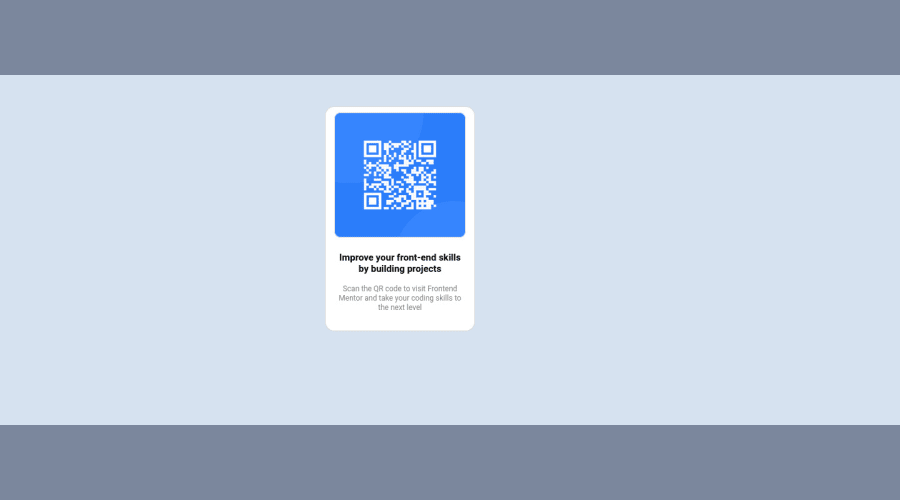
Replace <div class="br-container"> with the main tag,<p class="improve"> with <h1> to fix the accessibility issues. click here for more on web-accessibility and semantic html
There is no need to style .br-container, give its background-color to the body because the body has a wrong background-color.
To center .container on the page using flexbox, replace the height in the body with min-height: 100vh. there is no need for the margin value in .container.
Give h1 and p the same font-size of 15px and the same margin-left, margin-right and margin-top values. Give p a margin bottom value.
For a responsive content, replace the width in .container with max-width and increase its value. max-width 320px.
Replace the height in .card with a padding value for all the sides, this will prevent the content from overflowing on smaller screens and its a responsive replacement. padding: 16px
Give the img a max-width of 100% for a responsive image and a border-radius value, the rest are not needed.
Use relative units like rem or em as unit for the padding, margin, width values and preferably rem for the font-size values, instead of using px which is an absolute unit. For more on CSS units Click here
Hope am helpful.
Well done for completing this challenge. HAPPY CODING
