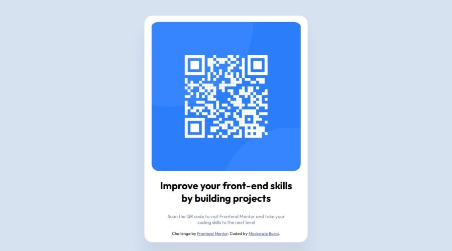
Design comparison
Solution retrospective
I am most proud of being able to look at an image of a website and being able to replicate it as closely as possible. I am used to being able to inspect live websites, so building based off a non-interactive image was challenging but fun!
What challenges did you encounter, and how did you overcome them?I do feel that there are sections I didn't quite nail, such as the paragraph alignment. And I do think there were potentially easier ways to code certain things, because I do have some repetition in CSS for text styling. I tried my best to use the padding and margin to align the text as close to the given image as possible.
What specific areas of your project would you like help with?I think what I'd like help with is making this suitable for mobile. I'm getting the hand of desktop but I would greatly appreciate some feedback and help with how to make sure a project still looks right on mobile.
Community feedback
- @0xabdulkhaliqPosted 6 months ago
Hello there ๐. Congratulations on successfully completing the challenge! ๐
- I have a suggestion regarding your code that I believe will be of great interest to you.
QR CODE NEEDS TO BE SCANNED :
- Since this component involves scanning the QR code, the image is not a decoration, so it must have an
alt
attribute.
- The
alt
attribute should explain the purpose of theimage
.
- E.g.
alt="QR code to frontendmentor.io"
<img src="/images/image-qr-code.png" alt="QR code to frontendmentor.io">
.
I hope you find this helpful ๐ Above all, the solution you submitted is great !
Happy coding!
Marked as helpful1 - @Andre-DMPosted 6 months ago
Hi there! I have a couple of tips that I hope you will find helpful! Let's start:
-
Always try to use Semantic HTML, such as
<header>
,<main>
,<article>
, because it increases the accessibility of your page, for example: Instead of<div id=โrootโ>
you could use<main class=โcontainerโ>
or<main id=โcontainerโ>
(I do not recommend using the word โrootโ for classes or ids, because in CSS it can be confused with the:root
selector.) I'll leave you a link if you want to learn more: W3School - Semantic HTML -
To avoid repetition in CSS, especially with text styles, you can include rules such as
font-family
,font-size
, or in the case of your specific code, evenfont-optical-sizing
in thebody
selector. -
Regarding feedback on mobile, I can recommend that you can start working on the project directly in mobile mode and then switch to desktop via media queries. CSS properties such as
min-width
,max-width
, ormin-height
andmax-height
, will help you manage the various elements on smaller screens, preventing them from getting too tight or too large. Perhaps this link can help you: CSS Tricks for Responsive Design
Anyway, your project is great! I really hope these tips were helpful to you, since I'm still learning too and these concepts were very useful to me!
Keep up the good work!
Marked as helpful1 -
Please log in to post a comment
Log in with GitHubJoin our Discord community
Join thousands of Frontend Mentor community members taking the challenges, sharing resources, helping each other, and chatting about all things front-end!
Join our Discord