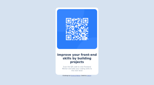
Design comparison
Solution retrospective
I am still find it hard to understand how sizing works especially if it mobile/desktop views. How to make it good looking?
Community feedback
- @ilyemmPosted over 1 year ago
Hi Najwa,
It looks good so far! I'm not sure what you mean by sizing works for mobile/desktop views, but I'd definitely look into flexbox and grid as that was something that was recommended to me for aligning things.
Additionally, I'd look into rem/em for sizing as well as I've used it often for not just font-sizing but also for setting margin and padding. :) I recommend Kevin Powell's "Are you using the right CSS units?" video to get a good understanding of the different units you can use to set things.
In regards to this solution, it looks like your solution centers pretty well regardless of the window size though I can't check width sizes lower than 447 pixels on my desktop.
You didn't ask about text, but it looks like the text stretches wider than the sample given. I'd use
max-width
as a way to control how much the text can stretch in a<div>
.Hoped this helped, and happy coding!
Marked as helpful1
Please log in to post a comment
Log in with GitHubJoin our Discord community
Join thousands of Frontend Mentor community members taking the challenges, sharing resources, helping each other, and chatting about all things front-end!
Join our Discord