Design comparison
SolutionDesign
Community feedback
- P@AbestianPosted 5 months ago
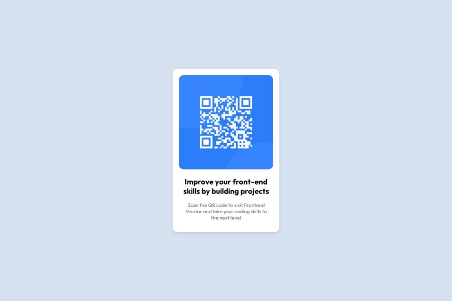
The solution incorporates semantic HTML, ensuring accessibility and a responsive layout that adapts well across most screen sizes. However, at a width of 320px (like on an iPhone 5/SE), the card feels cramped and could benefit from additional padding or margin. Overall, the code is well-structured, and the implementation closely mirrors the original design.
Marked as helpful0
Please log in to post a comment
Log in with GitHubJoin our Discord community
Join thousands of Frontend Mentor community members taking the challenges, sharing resources, helping each other, and chatting about all things front-end!
Join our Discord
