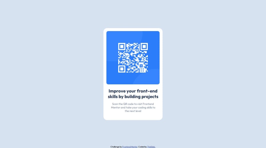
Design comparison
Solution retrospective
It is my first project on the platform and the truth is that it has taken me quite a while to get everything focused as I wanted it to be.
What challenges did you encounter, and how did you overcome them?The difficulties I found were centring the QR card and placing the footer at the bottom of the page.
I helped myself by setting borders to all the elements so I could see how the changes I made to the css code were behaving.
What specific areas of your project would you like help with?* { border: 1px solid red; }
For my first project I would say that the positioning of everything in its place as I said in the previous questions but otherwise fine.
Community feedback
- P@ferfalconPosted about 1 year ago
Hi Enrique, I hope you're doing well.
I noticed your solution closely matches the intended design, which is fantastic. To further enhance your project, consider incorporating more semantic HTML elements. For instance, replacing the <div> with the card class with a <main> tag and the <div> with the attribution class with a <footer> tag could improve both accessibility and SEO. These changes can be validated by generating an Accessibility report, which provides valuable insights.
Additionally, to make your layout more responsive, you might switch from absolute units to relative ones, like percentages, for element widths. Setting a max-width can also help maintain control over the layout's scalability, ensuring it looks great on both small and large screens.
I hope these suggestions are helpful to you. Keep up the good work!
Marked as helpful1@TheEdaL06Posted about 1 year ago@ferfalcon Thanks for the help. I will try doing in future projects what you have told me.
0
Please log in to post a comment
Log in with GitHubJoin our Discord community
Join thousands of Frontend Mentor community members taking the challenges, sharing resources, helping each other, and chatting about all things front-end!
Join our Discord
