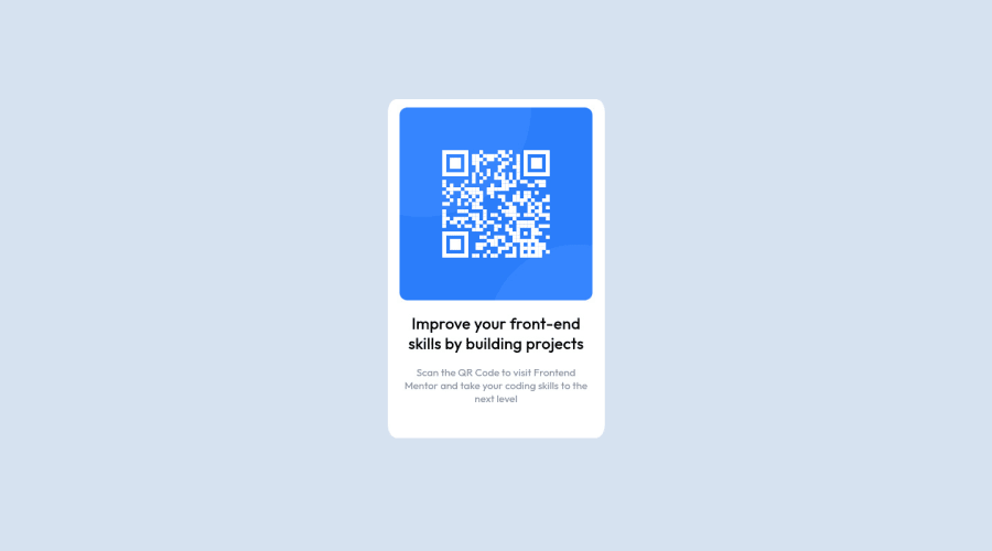
Design comparison
SolutionDesign
Community feedback
- @ToHXPosted almost 3 years ago
Good job! Some things which I did notice:
- You're missing an h1 in your HTML
- Class naming, do you use a specific format like BEM?
- font-size always in REM
- Fallback for the font-family is missing -Instead of for example Flexbox and padding you did work with fixed width and height which makes it not responsible (not an issue in this project though)
Marked as helpful1 - @RioCantrePosted almost 3 years ago
Hello there! Great work with this one. Regarding the solution you submitted, I think you should also take notes of the following…
- Remove
margin-top: 10%;in.qrcoderule set and adjust intomargin: 8rem auto;,padding-top: 1rem;andborder-radius: 10px; - Remove
margin-top: auto;,margin-left: auto;andmargin-right: auto;in.qrtextandimgrule set, addmargin: auto;
Above all, The design looks good. Keep it up! Hope this is helpful!
Marked as helpful0 - Remove
- @BerlinWebDevPosted almost 3 years ago
Thanks for you Feedback. I will use them in the next projects.
0
Please log in to post a comment
Log in with GitHubJoin our Discord community
Join thousands of Frontend Mentor community members taking the challenges, sharing resources, helping each other, and chatting about all things front-end!
Join our Discord
