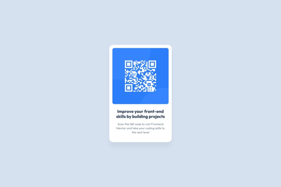
Design comparison
SolutionDesign
Community feedback
- @yiorgosbagakisPosted about 1 month ago
-
Quite good solution but the card is smaller and in particular the fonts.. That makes them less legible.
-
There are too many divs used so some semantic elements could be used more.
-
Overall very good work the code is well structured and it works well in all screen sizes
0 -
Please log in to post a comment
Log in with GitHubJoin our Discord community
Join thousands of Frontend Mentor community members taking the challenges, sharing resources, helping each other, and chatting about all things front-end!
Join our Discord
