

Design comparison

Solution retrospective
- How can I improve the html structure (semantics) ?
- How to center the main element vertically besides using the fixed value (i.e. I use
margin: 12em auto)? Maybe with percentage/vh or usingpositionas I think hard-coded value is not good - Should I use flexbox in this example?
- Should I implement BEM/OOCSS or Sass from now on for better organization?
Thanks for reading.
Any advice would be greatly appreciated!
Please log in to post a comment
Log in with GitHubCommunity feedback
- @BRIVAL-M
Hi :) For semantics, you can use the HTML tag <figure> to code your card.
And here is an image explaining the BEM, but you already know :) BEM tips img
Marked as helpful - @LuisJimenez19
Hi, congratulations on finishing the challenge.
You are correct there is a better way to center it. A tip is that whenever possible it is better to manipulate the content from its container. You can do this:
body {
    flex-direction: column;
    min-height: 100vh;
    display: flex;
    background-color: var(--bg-color);
    justify-content: center;
    align-items: center;
}
This will center everything perfectly. I see that you use
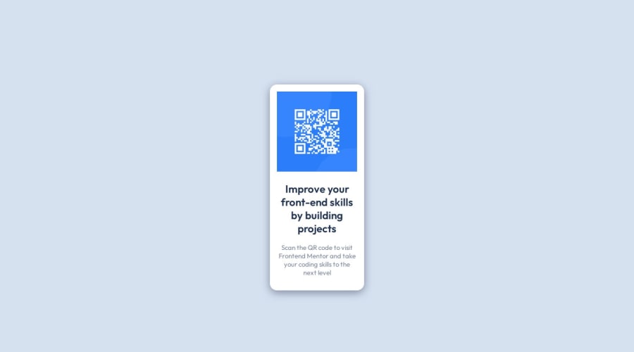
<main>to make the card, which is fine but would be better:<main> <div class="card" > <img src="images/image-qr-code.png" alt="qr-code"> <h2>Improve your front-end skills by building projects</h3> <p>Scan the QR code to visit Frontend Mentor and take your coding skills to the next level</p> </div> </main>and in this
.cardgive it the styles of the card, and if what you want is to leave the footer below you can apply to themaina ``flex-grow:1;I hope my contribution is helpful.
Marked as helpful


Join our Discord community
Join thousands of Frontend Mentor community members taking the challenges, sharing resources, helping each other, and chatting about all things front-end!
Join our Discord