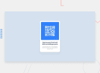
Design comparison
SolutionDesign
Community feedback
- @KaiPereiraPosted 10 months ago
You could make the card responsive by slapping on the .main (even though you probably don't need it):
width: 100%;
max-width: 250px;
Pls use less id's on your containers :) and a little less padding on your .main
0
Please log in to post a comment
Log in with GitHubJoin our Discord community
Join thousands of Frontend Mentor community members taking the challenges, sharing resources, helping each other, and chatting about all things front-end!
Join our Discord

