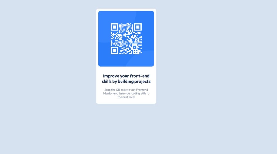
Design comparison
Community feedback
- @Raheem-kingPosted 10 months ago
Hi @AbdulRahmanBoyi I just viewed your code on GitHub and I noticed you didn't use grid and flex box . Using grid makes it easy for you to center elements I recommend U learn it if U haven't cause it will make things a lot easier and it is a modern way of efficient structuring
0@ABoyiSuleiman38971Posted 10 months agoThanks for the observation i will work on that @Raheem-king
0 - P@davidmoreau2Posted 10 months ago
use margin auto to position the element into the center of the screen. other than that it looks great. correct sizing and colors across the board
0@ABoyiSuleiman38971Posted 10 months agoNoted thanks i appreciate@davidmoreau2
0
Please log in to post a comment
Log in with GitHubJoin our Discord community
Join thousands of Frontend Mentor community members taking the challenges, sharing resources, helping each other, and chatting about all things front-end!
Join our Discord
