

Design comparison

Solution retrospective
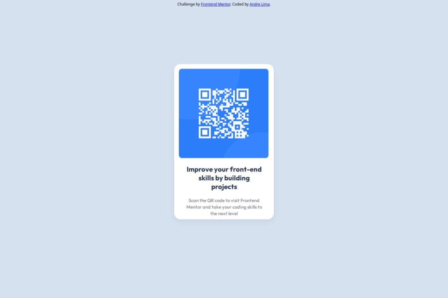
I'm proud of succeeded finish my first practice project with html and css. How it was done and the result itself, I'm proud of it. But next time, I'll definitelly have to translate better the guide file, because I was trying to do the figma design, not the image on the design folder, lol. After done, I think it is really close to the original image.
What challenges did you encounter, and how did you overcome them?The box model was the hardest part, I thought i did understood how it works in my beginner course on CodeCademy, but it was just the tip of the iceberg. I read tones of articles to understand just what I had to finish the challenge. I had to do the Qr code page responsive, and position a , in another propertly, to make it happen. So I found a way to do it reading articles about. But checking other persons sollutions I realize that my knowlege of box model is doesn't exist at all. The way I did the boxes in my sollution is all improvised. So I'll study more now, untill I take another challenge.
What specific areas of your project would you like help with?I want to know how you guys make a responsive page and how you deal with box model issues, because that was hard for me, and I think it can be many ways to solve the problem.
Community feedback
Please log in to post a comment
Log in with GitHubJoin our Discord community
Join thousands of Frontend Mentor community members taking the challenges, sharing resources, helping each other, and chatting about all things front-end!
Join our Discord