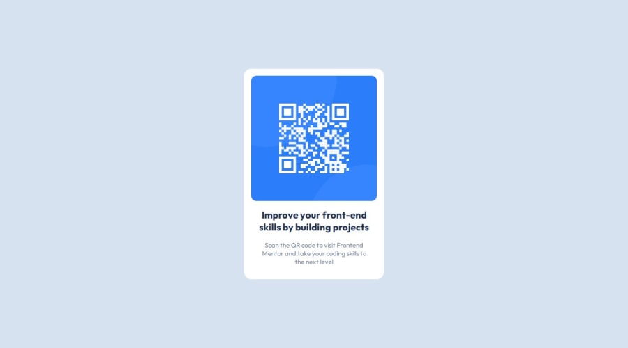
Design comparison
Solution retrospective
I am proud to have completed the challenge on my own by researching articles and resources to make the design as faithful as possible.
I would improve the way I write code cleaner and easier to modify and expand, also with practice I know more css properties that will allow me to better perform the design.
What challenges did you encounter, and how did you overcome them?Although it is a simple challenge, the biggest problem I faced is how to break down the layout structure, write html and css code in a way that uses good practices and semantic code as well as good use of class names.
It was not a very complex problem and I was able to solve it by quickly looking for information about these best practices.
What specific areas of your project would you like help with?Any improvement you can find in the code will be welcome from my side, I made the effort to make it as close as possible to the expected design, but I'm sure there is room for improvement ;)
Community feedback
Please log in to post a comment
Log in with GitHubJoin our Discord community
Join thousands of Frontend Mentor community members taking the challenges, sharing resources, helping each other, and chatting about all things front-end!
Join our Discord
