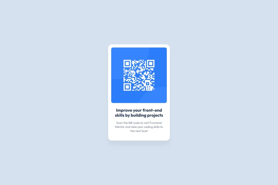
Design comparison
Solution retrospective
This is my project!
Community feedback
- @eaakrePosted over 1 year ago
Nice job! Looks very good on both desktop and mobile!
I noticed the text has a little less margin than the design. If you wanted to match it a little more you might make these changes in your CSS (only changed the margin attributes):
.card .card-title { color: hsl(218, 44%, 22%); font-weight: 700; font-size: 1.5rem; margin: 1rem .25rem; }
.card .card-text { color: hsl(220, 15%, 55%); font-size: 1rem; margin: 0 .25rem 1rem .25rem; }
Well done!
Marked as helpful1 - @AlbertooMunozzPosted over 1 year ago
Hola, Diego, te felicito por tu aporte a este reto 😃. El responsive de tu codigo es maginfico, ademas, es bastante acercado al diseño original, mi unica recomendacion en trabajar la vista en celulares estrechos, como el galaxy fold (280px x 653px). Espero puedas seguir subiendo mas aportes y sigas mejorando😎.
Marked as helpful1
Please log in to post a comment
Log in with GitHubJoin our Discord community
Join thousands of Frontend Mentor community members taking the challenges, sharing resources, helping each other, and chatting about all things front-end!
Join our Discord
