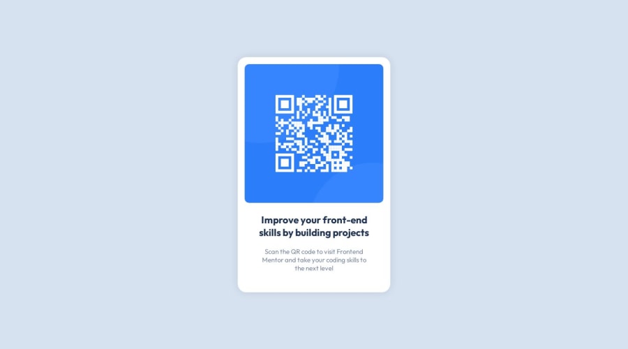
Design comparison
Solution retrospective
Hello!
-
I'm not entirely sure if the mobile responsiveness part could be considered as done only by the max-width trick that I applied on the container. The picture of the mobile design looked quiet the same to me so I thought that nothing should be done about it.
-
Also, I'm not sure if I used the information from style-guide.md correctly regarding the Desktop width. I just applied 1440px to the most outer container but it looks strange on my screen.
-
Please let me know if you have any tips about anything at all. I'd really like to learn more about good practices but I don't know where to go from here.
Thanks for reading!
Community feedback
- @AtefZakyPosted over 1 year ago
Hello! congratulation on completing your first challenge 🤟
I have some suggestions to make it better and I will try to answer your questions🔽
-
in the mobile view you should give some padding to the container to make space between the card and the browser window in extra small devices. and change the
height: 100vhtomin-height: 100vhlike that when the device's height is small your content will take up its space and the scroller will appear -
in this challenge, you don't need to give the container max-width because the content doesn't take the full screen but when you make this you will need to give the background color to the body or the parent of the container to see the background on a large screen.
I hope this helps you, overall nice solution, happy coding 👨💻
Marked as helpful1@mihai3636Posted over 1 year agoHello! Thank you! It's good to be here!
Yeah, just before you posted this reply I also noticed something was off with the mobile version and I added the html { font-size: 50%; } trick for smaller devices.
The padding to the container seems like a really clever idea and I will add it right away.
The rest of the feedback is helpful as well.
Thanks a lot, have a great day!
0 -
- @ofthewildfirePosted over 1 year ago
Hi! Your solution is really great
- In terms of the responsive design, you're correct, for this small component, what you've done with the
max-widthtrick is more than enough, its all you needed to do.
I only have a few suggestions, you currently have a
height: 100vhon your.container- this unfortunately cuts off the content when you zoom in, changing this to amin-height: 100vhwould solve this. You are also usingdisplay: flexin yourcontainerclass, which means your alignments usingalign-itemsandjustify-contentis handling the centering both vertically and horizontally, making yourmargin: 0 autoredundant.I hope this helps, its a perfect to me solution though. Well done~ :)
Marked as helpful1@mihai3636Posted over 1 year ago@ofthewildfire
Thank you for taking your time, this information is really helpful. Learned something new about the min-height 100vh and the zoom thing. It took me a while until I figured out what was the issue, but I tackled it down.
0 - In terms of the responsive design, you're correct, for this small component, what you've done with the
Please log in to post a comment
Log in with GitHubJoin our Discord community
Join thousands of Frontend Mentor community members taking the challenges, sharing resources, helping each other, and chatting about all things front-end!
Join our Discord
