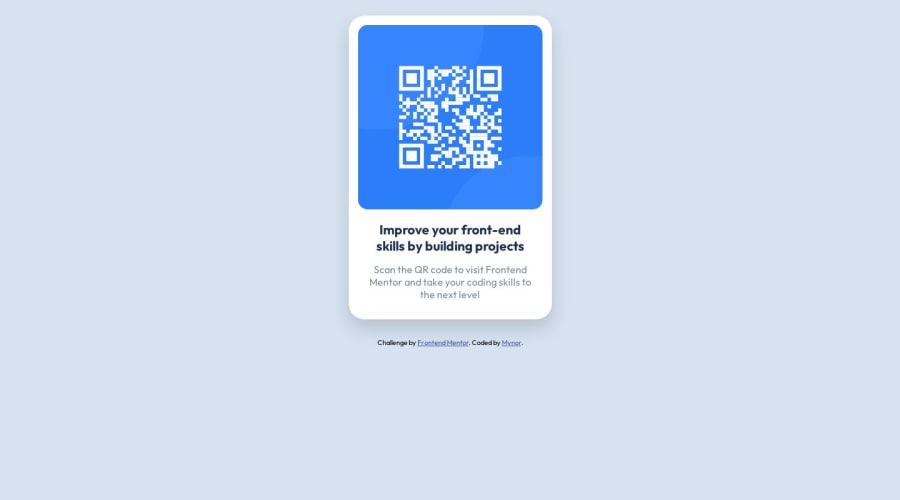
Design comparison
Solution retrospective
This first challenge was simple. My interest is leaning towards css flexbox and grid, but I'm still learning, so tried to keep it simple.
If you happen to check this project, any tips or best practices are welcome that could help my tag naming, overal structure and the order I used inside the CSS. It is a simple project, but any help from this humble beginings will be more than good.
Community feedback
- @Kamlesh0007Posted over 1 year ago
Hello there 👋. Congratulations on successfully completing the challenge! 🎉
I have other recommendations regarding your code that I believe will be of great interest to you. CSS 🎨:
Looks like the component has not been centered properly. So let me explain, How you can easily center the component without using margin or padding. We don't need to use margin and padding to center the component both horizontally & vertically. Because using margin or padding will not dynamical centers our component at all states To properly center the component in the page, you should use Flexbox or Grid layout. You can read more about centering in CSS here 📚. For this demonstration we use css Grid to center the component. body { min-height: 100vh; display: grid; place-items: center; }
Marked as helpful0 - @0xabdulkhaliqPosted over 1 year ago
Hello there 👋. Congratulations on successfully completing the challenge! 🎉
- I have other recommendations regarding your code that I believe will be of great interest to you.
HTML 🏷️:
- This solution may cause accessibility errors due to lack of semantic markup, which causes lacking of landmark for a webpage and allows accessibility issues to screen readers, due to accessibility errors our website may not reach its intended audience, face legal consequences, and have poor search engine rankings, highlighting the importance of ensuring accessibility and avoiding errors.
- What is meant by landmark ?, They used to define major sections of your page instead of relying on generic elements like
<div>or<span>. They are use to provide a more precise detail of the structure of our webpage to the browser or screen readers
- For example:
- The
<main>element should include all content directly related to the page's main idea, so there should only be one per page - The
<footer>typically contains information about the author of the section, copyright data or links to related documents.
- The
- So resolve the issue by replacing the
<div id="card">element with the proper semantic element<main>along with<div class="attribution">into a<footer>element in yourindex.htmlfile to improve accessibility and organization of your page
.
I hope you find this helpful 😄 Above all, the solution you submitted is great !
Happy coding!
Marked as helpful0 - @HassiaiPosted over 1 year ago
Replace <div id="card"> with the main tag and <h4> with <h1> to make the content/page accessible. click here for more on web-accessibility and semantic html
Every html must have <h1> to make it accessible. Always begin the heading of the html with <h1> tag wrap the sub-heading of <h1> in <h2> tag, wrap the sub-heading of <h2> in <h3> this continues until <h6>, never skip a level of a heading.
There is no need to give the body a padding value.
To center #card on the page using flexbox or grid instead of margin:
- USING FLEXBOX: add min-height:100vh; display: flex; align-items: center: justify-content: center; to the body
body{ min-height: 100vh; display: flex; align-items: center; justify-content: center; }- USING GRID: add min-height:100vh; display: grid place-items: center to the body
body{
min-height: 100vh;
display: grid;
place-items: center;
}
Use relative units like rem or em as unit for the padding, margin, width values and preferably rem for the font-size values, instead of using px which is an absolute unit. For more on CSS units Click here and here
Hope am helpful.
Well done for completing this challenge. HAPPY CODING
Marked as helpful0
Please log in to post a comment
Log in with GitHubJoin our Discord community
Join thousands of Frontend Mentor community members taking the challenges, sharing resources, helping each other, and chatting about all things front-end!
Join our Discord
