

Design comparison
SolutionDesign

Solution retrospective
What challenges did you encounter, and how did you overcome them?
The main challenge that I encountered in this project was vertical alignment of the parent container. I recheck my entire CSS stylesheet and finally by giving 100% height for the html, i was able to achieve it.
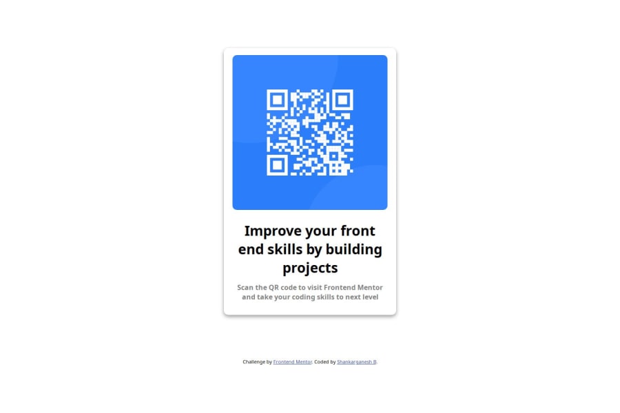
What specific areas of your project would you like help with?the image provided was too large and I had to resize it to be smaller. my doubt is that, if that is how this should be done or am I missing out on something, which would help get proper sized image without nay need for altering. Also I don't understand why the mobile resolution give is too low.
Community feedback
Please log in to post a comment
Log in with GitHubJoin our Discord community
Join thousands of Frontend Mentor community members taking the challenges, sharing resources, helping each other, and chatting about all things front-end!
Join our Discord