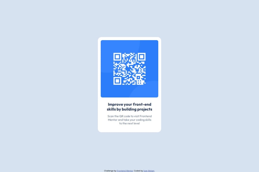
Design comparison
SolutionDesign
Solution retrospective
What are you most proud of, and what would you do differently next time?
Look closer into the FIGMA file at the beging, understand the scope of work better.
Also try to find solutions that scale bette. Semantic HTML as well
What challenges did you encounter, and how did you overcome them?Spacing issues, I didn't look at the Figma file enough to see it provided me with everything. Maybe look into a Figma for web devs tutorial/guide.
What specific areas of your project would you like help with?Organising my CSS, I always feel like I don't do a good enough job. Also accessibility with my code
Community feedback
Please log in to post a comment
Log in with GitHubJoin our Discord community
Join thousands of Frontend Mentor community members taking the challenges, sharing resources, helping each other, and chatting about all things front-end!
Join our Discord
