

Design comparison
SolutionDesign

Solution retrospective
What are you most proud of, and what would you do differently next time?
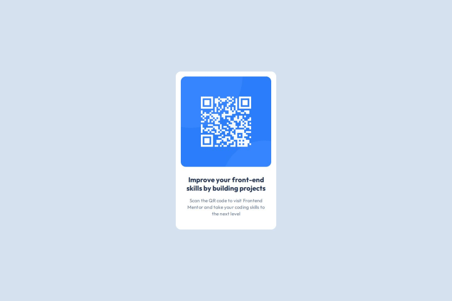
I achvieve create a project too close to design in figma, including the responsive design. I hope improve it with availability to create own QR Codes based on some inputs and save them into a Database.
What challenges did you encounter, and how did you overcome them?I didn't remember how to assign responsive text depending on screen size but with a little search on documentation in W3Schools, I was able to achive it.
What specific areas of your project would you like help with?Making a comparisson with figma design and providing feedback on reponsive behavior.
Community feedback
Please log in to post a comment
Log in with GitHub
Join our Discord community
Join thousands of Frontend Mentor community members taking the challenges, sharing resources, helping each other, and chatting about all things front-end!
Join our Discord