

Design comparison

Community feedback
- P@Islandstone89Posted 7 months ago
HTML:
-
Every webpage needs a
<main>that wraps all of the content, except for<header>andfooter>. This is vital for accessibility, as it helps screen readers identify a page's "main" section. Wrap the card in a<main>. -
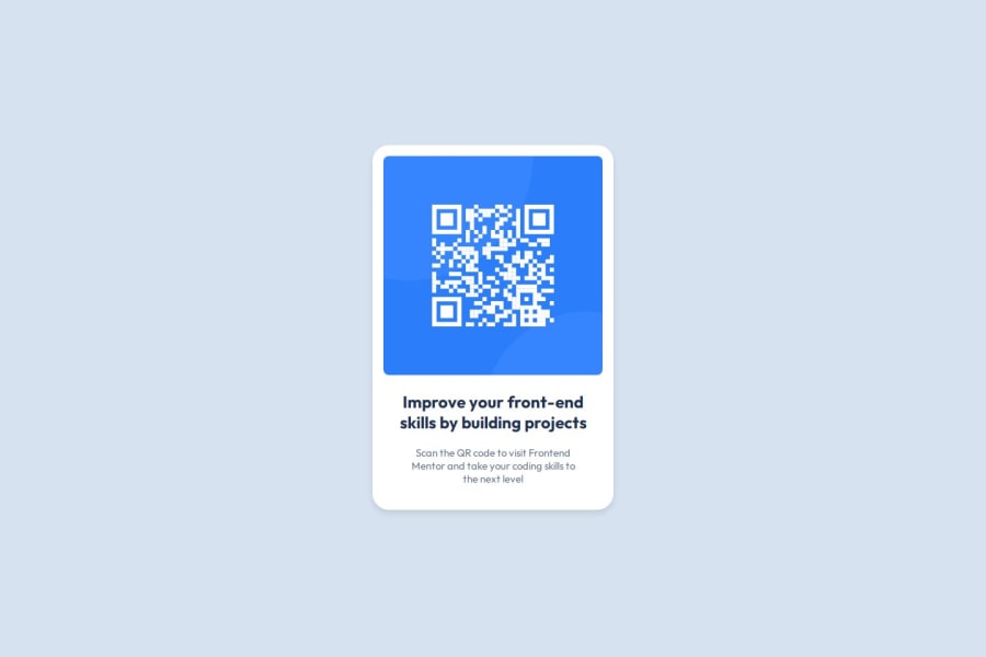
The alt text should be written naturally, without using
-between the words. It must also say where it leads(the frontendmentor website). A good alt text would be "QR code leading to the Frontend Mentor website."
CSS:
-
Including a CSS Reset at the top is good practice.
-
I recommend adding
1remofpaddingon thebody, to ensure the card doesn't touch the edges on small screens. -
On the
body, change themin-heightto100dvh. -
Remove the
widthon the card. We rarely want to give a component a fixed size, as we want it to grow and shrink according to the screen size. -
We do want to limit the width of the card, so it doesn't get too wide on larger screens. To solve this issue, give the card a
max-widthof around20rem. -
Remove all widths in
%. -
font-sizemust never be in px. This is a big accessibility issue, as it prevents the font size from scaling with the user's default setting in the browser. Use rem instead. -
On the image, add
display: blockand changemax-widthto100%- the max-width prevents it from overflowing its container. Without this, an image would overflow if its intrinsic size is wider than the container.max-width: 100%makes the image shrink to fit inside its container. -
As the design doesn't change, there is no need for any media queries. When you do need them, they should be in
remorem, not px. Also, it is common practice to do mobile styles first and use media queries for larger screens.
2@SayedM009Posted 7 months ago@Islandstone89 First of all, I would like to thank you for those important instructions for me, which will push me to improve my level continuously. I would like you not to stop giving these tips to everyone to benefit everyone. Thank you.
1 -
- @malavez890Posted 7 months ago
Awesome job tackling this challenge! You’re doing amazing.
I wanted to share a tip with you to put the card in the center. code snippet:
.container { display: grid; place-items: center; } Hope you found this comment helpful 💗💗💗
Good job and keep going 😁😊😉
1


Please log in to post a comment
Log in with GitHub
Join our Discord community
Join thousands of Frontend Mentor community members taking the challenges, sharing resources, helping each other, and chatting about all things front-end!
Join our Discord