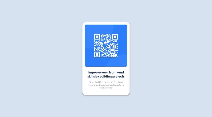
Design comparison
SolutionDesign
Solution retrospective
What are you most proud of, and what would you do differently next time?
Review all aspects of design before starting it
What challenges did you encounter, and how did you overcome them?Finding Figma css properties. Just need to get more tasks done to get used to it
What specific areas of your project would you like help with?css reviews
Community feedback
Please log in to post a comment
Log in with GitHubJoin our Discord community
Join thousands of Frontend Mentor community members taking the challenges, sharing resources, helping each other, and chatting about all things front-end!
Join our Discord
