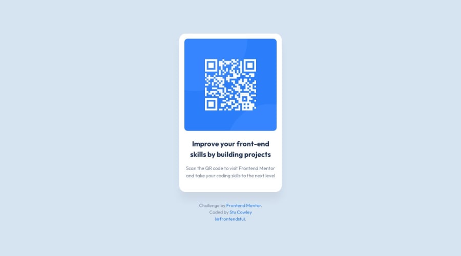
Design comparison
Solution retrospective
This was a very straightforward project. It was a good introduction to get the motivation flowing. I’m happy with the look of it and I think it will be very close to the original design. I may fall short with the leading of the heading and content. Probably using Sass for this project was a bit overkill, but I have been using it for many years and I just can't stop using it. I like that you can break your styles up into partials so your code looks a lot neater while building out a project. CSS can be a bit of a rats nest at times.
Community feedback
Please log in to post a comment
Log in with GitHubJoin our Discord community
Join thousands of Frontend Mentor community members taking the challenges, sharing resources, helping each other, and chatting about all things front-end!
Join our Discord
