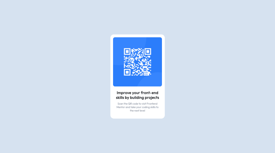
Design comparison
Community feedback
- @HassiaiPosted almost 2 years ago
Replace <div class="container"> with the main tag to fix the accessibility issues. click here for more on web-accessibility and semantic html
There is no .container a width value and background-color, give the background-color you gave to .container to the body.
To center .card on the page using grid, replace the height in the body with min-height: 100vh.
Replace the height in .card with a padding value fo r all the sides, this will prevent the content from overflowing on smaller screens and its a responsive replacement.
padding: 1rem which is 16px.There is no need to style .card-image rather give the img a max-width of 100% and a border-radius value the rest are no needed.
Give .information a margin value for all the sides, text-align: center and a font-size of 15px which is 0.9375rem, this will be the font-size of both p and h1.
Use relative units like rem or em as unit for the padding, margin, width values and preferably rem for the font-size values, instead of using px which is an absolute unit. For more on CSS units Click here
Hope am helpful.
Well done for completing this challenge. HAPPY CODING
Marked as helpful0@maykol-vallejosPosted over 1 year ago@Hassiai Thank you very much for your feedback, they helped me a lot to save lines of code and improve my programming style, have a nice afternoon. :D
0
Please log in to post a comment
Log in with GitHubJoin our Discord community
Join thousands of Frontend Mentor community members taking the challenges, sharing resources, helping each other, and chatting about all things front-end!
Join our Discord
