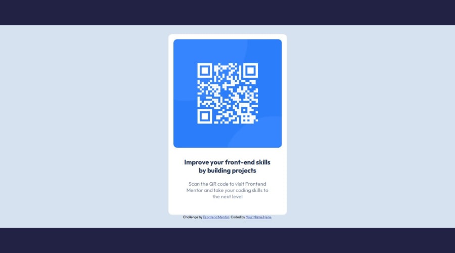
Design comparison
Solution retrospective
Happy with how fast this was to put together (really simple microproject though). I used the extra time to hone on quick and tidy flexbox positioning, along with eyeballing font relative size differences.
Really eager to get back into the Figma docs where the specs are clearly laid out but need to get the basics down to a fast-paced T first, and part of that is making visual guesses.
What specific areas of your project would you like help with?The card is fixed width as per the project description (I'm treating these as if they came from real clients/supervisors, who are clear on what they want).
That said, setting a fixed width allowed me to "hide" certain scaling issues which would have popped up had this been made responsive. My responsive design is still kind of moderate (stylings take me more CSS lines than they reasonably should) so if anybody has any clean and concise ideas on making this card fully responsive I would be most grateful.
Please log in to post a comment
Log in with GitHubCommunity feedback
- @Alexr6667
Really good start.
You could simplify the css a little and resize the card to match the Figma design.
Join our Discord community
Join thousands of Frontend Mentor community members taking the challenges, sharing resources, helping each other, and chatting about all things front-end!
Join our Discord
