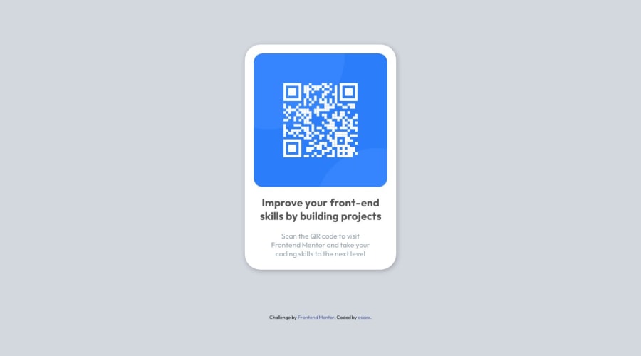
Design comparison
SolutionDesign
Solution retrospective
What are you most proud of, and what would you do differently next time?
I'm proud that i started this journey, would have chosen better colors and made text look better
What challenges did you encounter, and how did you overcome them?finding the right dimensions for text and design
What specific areas of your project would you like help with?how can I be more precise when choosing colors, and sizing things
Community feedback
Please log in to post a comment
Log in with GitHubJoin our Discord community
Join thousands of Frontend Mentor community members taking the challenges, sharing resources, helping each other, and chatting about all things front-end!
Join our Discord
